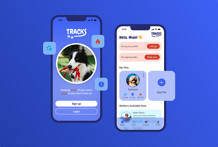
Dog Walking App - Case Study
Keeping Track of your Pet's Steps
Hello 👋
Tracks is a dog walking app designed for Dribbble's Product Design Course. Over the period of 9 weeks, my goal was to create a simplified service that connects dog owners to reliable and trustworthy dog walkers.
I found that a lot pet owners don't have enough time to make sure their dog is getting enough exercise, and that it can be very difficult to find a dog walker that an owner can trust and rely on. Tracks is here to solve those problems.
Follow along to learn more about Tracks and my design process! 🐶
User Research 🔬
I began this project by getting to know my target audience as well as what the market is currently using for dog walking solutions.
I conducted multiple interviews of dog owners and found the following to be their biggest pain points:
Lacking trust
Lacking reliability
Lacking consistent availability
Apps are too expensive
During the market research phase, I found that most dog walking apps have over-complicated user flows, they don't offer the best communication between dog owners and dog walkers, and often times the prices and fees are too expensive.
User Flow 🏗️
I created my user flow by focusing on my users' pain points and conducting market research on competitor apps. I wanted to simplify the process of booking a walk but also make sure dog owners feel comfortable with their dog walker.
I started by building out an onboarding process to teach users the simple process of booking a walk with Tracks. Once a dog owner completes their personal profile as well as adding a profile for their dog, the booking process is quick and easy. The dog owners can keep in close communication with their dog walker, they can track walks and their dog's stats, and they can choose to set up a consistent schedule with that walker if needed.
Ideation & Wireframes 💡
I worked through several iterations of wireframes starting with sketches, then I used Figma to design low-fidelity followed by high-fidelity wireframes that would be ready for visual design. I designed a wireframe for every step of my user flow to ensure simplicity and ease of use. I also focused on creating modern elements.
Visual Design 🎨
When a dog owner looks at Tracks, I want them to feel like they can trust the dog walkers with their pet and that they’re in good hands. With that in mind, I designed the interface to have a clean and simple look while incorporating bright pops of color to bring energy and excitement.
The color palette aims to evoke feelings of loyalty, trust, and ambition for dog owners when they search for the right dog walker. It infuses a sense of excitement and energy, which is balanced by the rounded elements and the strategic use of negative space, contributing to the overall clean and simple feel.
I then meticulously placed color and scaled the design elements throughout the wireframes to produce the final product.
Prototype & User Testing 💻
Prototyping and testing were my next steps to ensure Tracks could be the solution to my users' pain points. It also helped to discover any flaws in the design and user flow of the app.
Building the prototype was a challenging but fun part of the process. I experimented more with smart animate to bring my vision of the app to life, and then passed it along to some users for review.
I conducted a handful of user tests asking questions like:
"How would you search for a walker?"
"Can you then book a walk with that person?"
"How would you add a pet profile?"
"How does the over all look and feel of the app, make you feel?"
I got a lot of positive feedback from those users and they were able to complete the main task with ease - booking a walk.
Final Thoughts 🧠
This course allowed me to fully immerse myself into the product design process. I designed an app from start to finish! Here are my big takeaways:
I developed more empathy towards the user, prioritizing their needs.
I learned more about Figma and its endless capabilities.
I gained perspective on parts of the design process I thrive in and parts that I don't.
I grew as a designer.
I'm excited to carry this knowledge into future projects and continue growing in the product design space.
Thanks for following my journey!


