Brand identity - logotype - logo design - Community logo
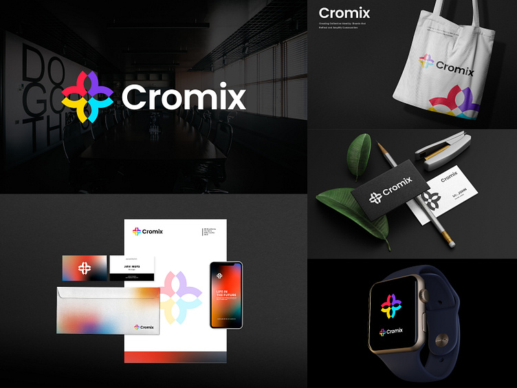
Logo: The logo for "Cromix," a community-focused company, consists of a logo mark and a community-inspired icon.
Explanation: The logo mark "Cromix" is designed with a bold and modern font, representing professionalism and confidence. The accompanying icon features interconnected figures forming a circle, symbolizing unity and teamwork. The vibrant colors, such as red and yellow, evoke energy and positivity. Overall, the logo represents "Cromix" commitment to fostering connections, collaboration, and inclusivity within the community.
I hope this logo concept meets your expectations. If you'd like to make any changes or modifications, just let me know!
💲💲💲➟ Unused, Available For Sell 💲💲💲
Interested in working with me? 👍👍
Let's make a mark, together!
Send Message on - WhatsApp | Telegram | Instagram | Linkedin


