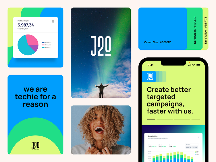
J2O - Brand Identity & Guide
Logo
The logo comprises the J2O word mark. The logo is minimal yet modern and to the point. This also describes the brand narration.
Colour Versions
Colour is the first visual thing we remember, and a powerful asset in building brand recognition. Our colour is ocean blue. We use it first, last, and for nearly everything in between.
Brand Colors
Bringing colour to life: The colour palette that defines our brand. Discover the vibrant hues that represent our unique identity and learn how to use them to create a memorable and impactful brand experience. Lets start with the basic primary and secondary colours.
Colour Ratio
The power of proportion: Crafting a balanced colour scheme. The colours you choose for your brand can make a big impact on how it is perceived. By understanding the importance of colour ratios, you can create a harmonious and memorable brand experience that resonates with your audience.
Typography
The typographic system is built on legibility and accessibility. It’s clear, bold, and when we use our international glyphs endlessly expressive.
Manrope
Manrope’s simplicity, clarity and rounded forms make it the perfect functional typeface for us. Always default to Manrope. Unless you’re being expressive, use Manrope to make sure you communicate easily with everyone, especially in product. The font can be downloaded from https://fonts.google.com/specimen/Manrope.


