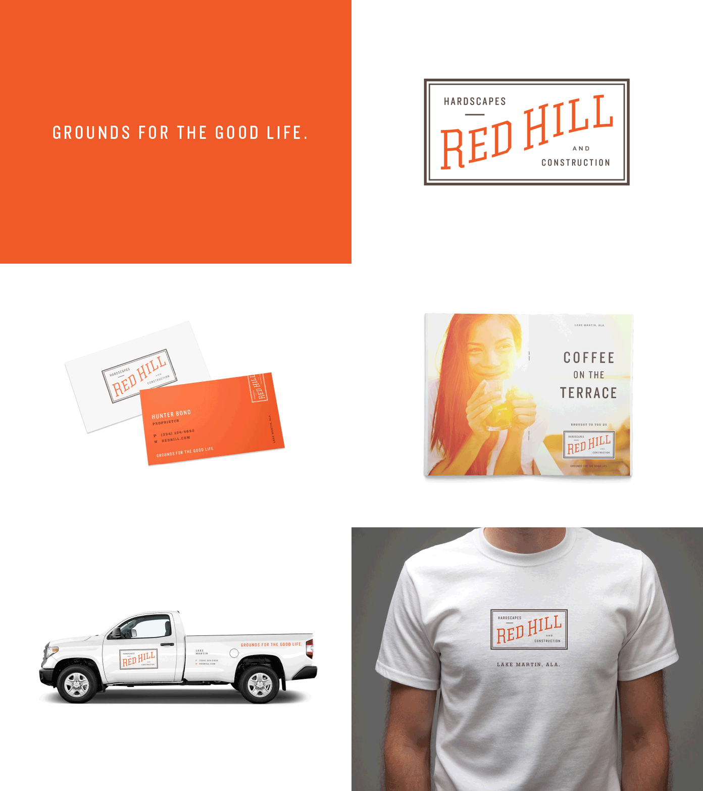
Red Hill Hardscapes and Construction
Here's the winner winner chicken dinner! This approach ultimately felt like it had more *life* in it. The previous one, while cohesive and appropriate, lacked the good vibes that lake life provides.
While I don't do *timeless* (shoot me an email and I'll tell you why), I was looking for something that felt classic, but not vintage. And ironically, "doing vintage" can feel very trendy. So I wanted to create a concept that didn't really have a concept. It doesn't look like anything. There aren't hidden shapes in the negative space that relate to the business. It's a meta-approach, in a way. The form *is* the concept.
/poop emoji
More by Ryan Harrison View profile
Like

