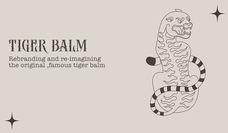
TIGER BALM RE-BRANDING Personal project
I've always been drawn to the unique and timeless designs of vintage brand packaging. I love the way that these old packages tell a story about the products and the time period in which they were made.
Recently, I became particularly fascinated with the packaging of Tiger Balm. I was drawn to the classic yellow and red design, as well as the iconic tiger logo. However, I also felt that the packaging design was outdated and could be modernised to better reflect the product's high-quality ingredients and healing properties.
As a graphic designer, I decided to take on the challenge of rebranding Tiger Balm's packaging . I started by researching the history of the product and its current branding. I analysed the key elements of the original packaging and thought about ways to modernise them while still staying true to the brand's identity...
Enter your text herInitially I generated a variety of concepts and design directions. I sketched out ideas on paper and explored different colour schemes, typography styles, and packaging designs. I then narrowed down these ideas to a few strong concepts that I felt best captured the essence of the brand and its values. Once I had some solid concepts, I began to refine the design direction. I created digital mockups of the packaging, experimenting with different colour combinations and layout stylese...
Enter your text here.After several rounds of ideation and exploration, I settled on a new packaging design that I felt captured the essence of the original Tiger Balm while giving it a modern twist.
When rebranding Tiger Balm, I wanted to create a fresh and modern look while still paying homage to the brand's heritage. As such, I decided to use a colour palette that combined classic elements with modern touches.
One of the primary colours that I used in my design was olive green. I chose this colour because it represents nature and healing, which are central themes of the Tiger Balm brand. I also felt that the earthy tone of olive green conveyed a sense of timelessness and stability. In addition to olive green, I also used orange as a complementary colour as i felt that it conveyed warmth and energy which resonated with tiger balm . This colour also has associations with health and vitality, which was a perfect fit for the Tiger Balm brand.
the olive green and orange colours created a harmonious and balanced colour palette that conveyed the natural ingredients and healing properties of the product while also giving it a fresh and modern look. I was thrilled with how these colours worked together to create a cohesive and appealing design that effectively communicated the values of the brand...


