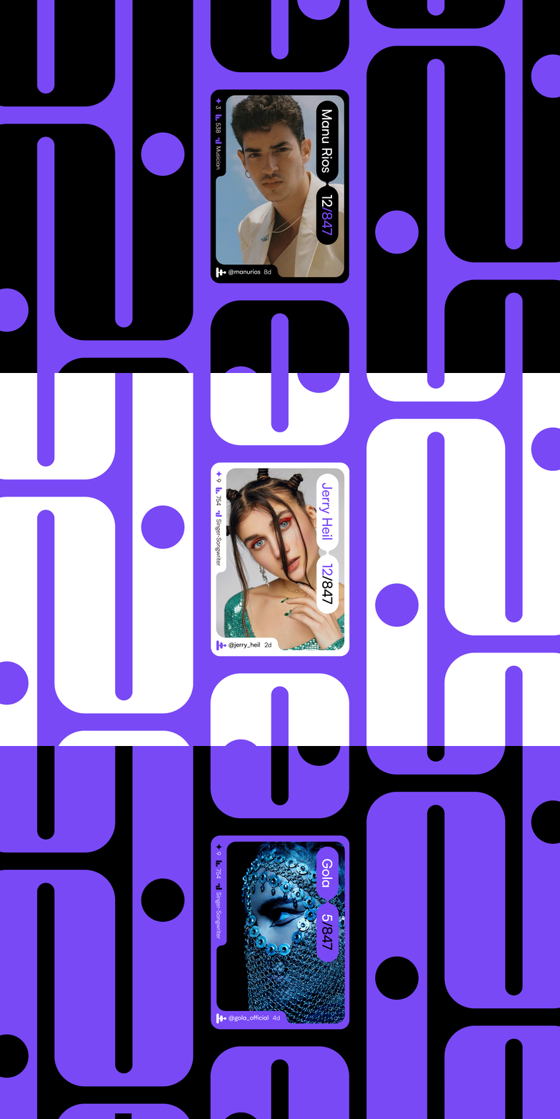
Stage Brand Identity
Do you remember the days when music talent shows were only accessible through your TV screens? In this day and age, aspiring artists strive to grab attention to show their talent on social media but often find themselves lost in the vast ocean of content.
Studio Herrström had the opportunity to work with Stage, a new app focused on how we can discover the next generation of stars in music. By combining the best aspects of The Voice and TikTok, Stage's unique round-by-round competition format allows aspiring artists to showcase their talents and gain visibility among supportive fans and audiences.
Join Stage and discover the next generation of stars today.
At the core of Stage's branding is a carefully crafted design system centered around a symbol with multiple meanings. It represents an elimination tournament bracket while also serving as a play button and an abstract equalizer, creating a bold visual element that captures the essence of the platform.
By utilizing a consistent application of graphic elements, including a color palette, typography, patterns, imagery, and iconography, Stage's cohesive and recognizable brand identity positions the platform as a competitive player in the industry and a steadfast supporter of artists' professional growth.
The Stage coin symbol was also designed, acting as a reward for winning competitions in the app. From the coin symbol, a pattern was developed that references the career paths of evolving artists. These two symbols, in combination with the career-path pattern, create a dynamic design system that works across all touchpoints of the brand and product.
The brand is further expressed through a dynamic carousel that emphasizes the idea of an equalizer and sound present in the Stage symbol. This carousel allows the brand to express the idea of discovering new talents.
Design Studio: Studio Herrström
Creative Director: Erik Herrström
Art Director: Lukas Haider
Client: Stage
Francisco Quartin de Macedo
Geoffrey Doyen
Parker Howard
Thomas Chrétien.


