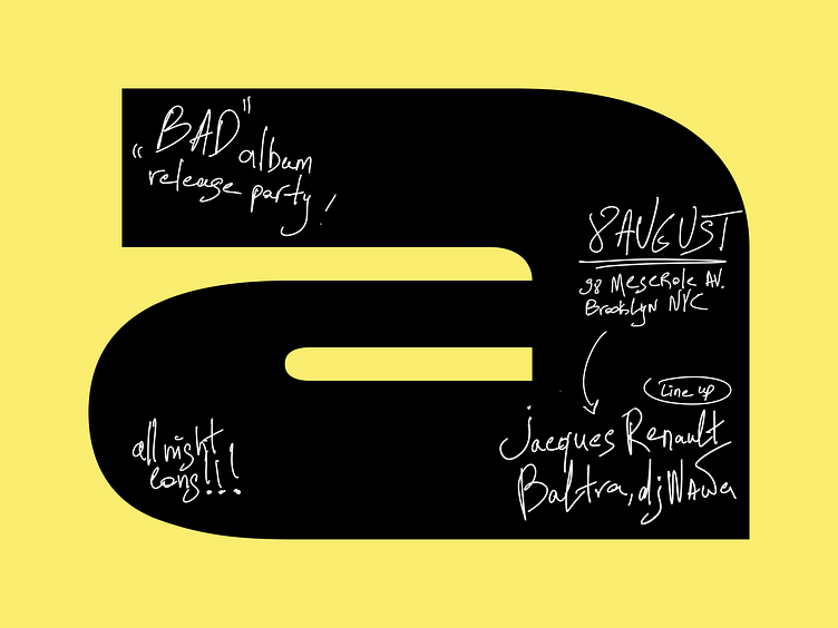
Typography poster concept
Hey everyone 👋
I created this poster concept during the «Design Practice» intensive workshop.
The main purpose was to create poster with unusual shape of the sheet, not to use an ordinary «A blank» format. So I came up with an idea that we can use a letter shape as a main form of the sheet for our poster. Moreover we can use different letters as a main form, so we have plenty of variations for our posters.
What do you think?
Let me know in comments 🙂
More by Kirill Epler View profile
Like


