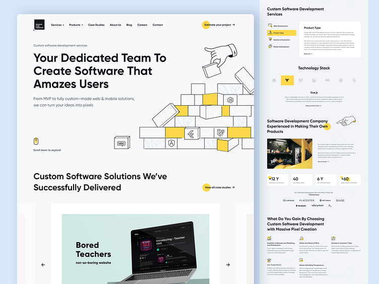
Website redesign for Massive Pixel Creation
Hello Everyone 👋
We are proud and excited to share the new Massive Pixel Creation website, which went through a massive makeover (pun intended) 💥
Massive Pixel Creation is a software development company based in Poland, that doesn’t only deliver superb projects to clients from all over the world but also develops its own solutions to be shared with the world. This gives us first-hand experience and a deep understanding of the business side of design and helps us empathize with our customers. Our projects aren’t only eye-pleasing, modern, and in tune with the best UX/UI best practices — they’re also created with marketing and monetization opportunities in mind.
The goal of the project was to refresh the image of the website in order to attract the audience more effectively and create more space for carefully selected content. This was achieved by conducting research, giving the site a modern and clear look, which highlights useful content, and creating new distinctive illustrations that enhance the brand image.
The Deadly Sins Of The Old Website
In the previous iteration of the project, we put a strong emphasis on creative solutions that unfortunately made the website slow and bulky. As the content grew over time, the website stopped looking good. On the landing pages, it was clear that all modules were designed by different people, resulting in a chaotic layout. Adding new pages was time-consuming and required involving many specialists.
That’s why, the new version of the website had to be simple and flexible enough to make building new sections a breeze, yet stay pleasing to the eye. Style-wise, the previous version resembled a creative agency website — too many interactive elements dancing to their own tune. To avoid doing that again, we came up with entirely new guidelines for us to follow.
New Commandments
This time, we wanted to highlight the company’s brand image as a software development company. The website is more formal, orderly, and structured. We paid more attention to typography and created more delicate, less busy illustrations. We made a decision to substitute the dark sections with the softer ones, making the website more legible and easier to navigate. MPC’s brand color — yellow — was used only for accents. All the other colors were softened to pastels so that users wouldn’t get distracted.
At the same time, we didn’t want to let go of our creative spirit entirely. We’ve expanded our illustration set, which gave us the opportunity to go wild. The recurring theme of the set became a hand, which supports different types of content — more on that in a different post ;)
The Challenges Only Made Us Stronger
The biggest challenge for our designers was to combine a transparent design with long-winded content, created with SEO needs in mind. We wanted to present the longer forms in an attractive enough way to engage readers without overwhelming them while staying true to the SEO principles.
After examining the needs of MPC we came to the conclusion that different branches of our company have different audiences. On the “Careers” page, we needed to present our creative and friendly side, while on the pages with Case Studies and Services, we had to showcase our professionalism & knowledge, based on the years of experience.
Both these groups had to be encouraged to get in touch with us, so we shortened that user path as much as possible. We also had to keep in mind that both these groups are enticed by different things. For that reason alone, we had to design different forms to suit them both.
📝 What was done?
— Research
— UX/UI design
— Illustrations
🔆 What tools did we use?
— Figma
— Adobe Illustrator
That was a huge project, but the satisfaction for us designers was even greater. Congratulations to the great team Malwina Pakuła and Justyna Hodura. At the moment, you can view our website at 👉 www.massivepixel.io
What do you think, guys? We hope you like it ❤️
We are ready to create something wonderful for you, too!
Join us on: LinkedIn • Facebook • Twitter • Instagram • Awwward • Discord Community

