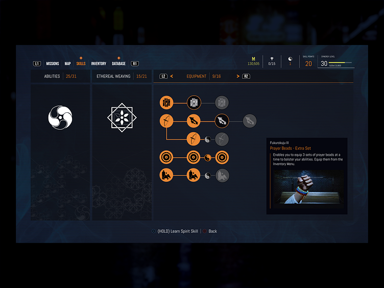
Ghostwire: Tokyo - UI Screen Refinements
Ghostwire: Tokyo is one of the latest games I've played, and honestly, I found the UI and Design application fantastic!
I was fascinated by how the actions and interactions behaved when the character used his powers, how the element's micro-animations, and visual identity matched the game storyline (a haunted Tokyo overrun by supernatural forces).
Why not try to reproduce a few of the UI elements in Figma?
.....................................
Before getting started...
Before starting the Design project right away, I like analyzing how elements were built, the proportions used, why the alignment used was "x" and not "y", why the spacing used was not consistent throughout the screen.
As a few questions were made,
And I started improving the spacing and element positioning by using a consistent spacing between elements (increase legibility and recognition), aligning elements correctly and using consistent font sizes:
> All "atomic" elements were used to create more complex components (as the main selection bar), and I was able to design a UI Screen application of easy maintenance, in which the elements arrangement can be easy modified for better visualization and for Multiple Screen's Design.
> My goals was to replicate the UI Screen in a way that its easy to represent and update.
...........................
Next steps:
As I continue to replicate the Screens, I wanna be able to reproduce the majority of elements used in the Game UI, and create a live components library of the whole game. Another goal is to create a few micro-animations in Figma, as a way to test out the software capabilities of representing quick ideas that are really close to the final result.

