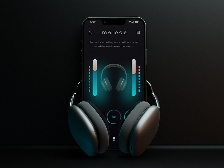
mélode - Audio EQ
I'm not one for overusing gradients and colour shadows in my designs but I felt like I could make an exception for a music related app. Makes it more dramatic, in my opinion.
(Slightly inspired by the old V4A EQ app)
UX-wise, it's quite simple: three buttons in the bottom nav-bar (EQ, Home and Settings. The icons are self explanatory), little "help" icons that open useful tips when tapped and big buttons for ease of use.
More by iSteven View profile
Like


