UI Exercise
Remake of a messaging app interface
This class project focuses on reimagining the user interface of a messaging application while maintaining its core functionality. The primary goal was to experiment with UI components to enhance the user experience by making small yet impactful design changes.
Project Constraints & Approach
The challenge was to modify only the visual aspects of the interface—without altering the underlying structure or features—by refining icons, adjusting button sizes, and exploring color schemes. The redesign was limited to two key screens:
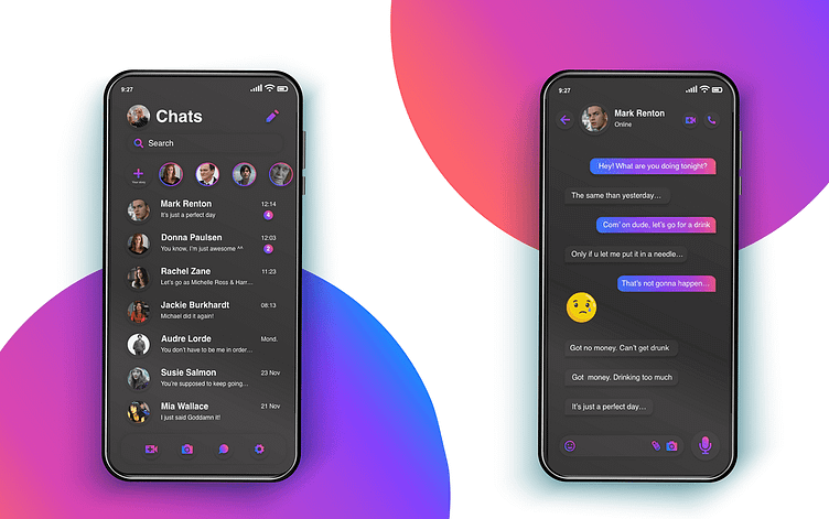
Message List Screen
Conversation Screen
These two screens were chosen as they represent the core user interactions within the app.
Key Design Decisions & Improvements
Emphasizing Voice Messaging
- A major design shift was to prioritize voice messaging over text input.
- The voice message button is now centrally highlighted, reinforcing its importance.
- The button dynamically transforms into a "Send" button only when the user enters text, ensuring a seamless and intuitive experience.
Refined Visual Identity
- Inspired by Instagram’s color palette, the interface adopts a fresh and familiar aesthetic while maintaining the unique identity of the messaging app.
- Iconography has been updated to enhance clarity and usability.
- The border radius of sent message bubbles has been adjusted to create a more modern, fluid, and visually appealing chat experience.
Outcome & Learning Experience
This redesign exercise provided valuable insights into UI refinement by demonstrating how subtle visual adjustments—such as color choices, button placement, and icon selection—can significantly impact usability and user perception. The challenge also reinforced the importance of balancing aesthetics with functionality in digital product design.
