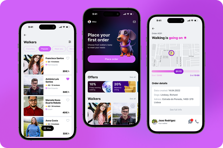
Tail wag—dog walking app
Hello! The app is a product of Dribbble's Product Design Course, designed specifically for dog owners. It simplifies pet care responsibilities, ensuring your beloved dogs are always well-cared for.
Purpose: UX/UI Case study, Dribbble's Product Design Course
Timeline: 04 March - 25 May
Tools: Figma, Notion, Midjourney
1
Design brief & Problem statement
My goal was to create an app to help dog owners solve the problem of walking their dog, rehoming, or grooming when the owner can't do it themselves. It is based on market analysis data, user interviews, business model definition, product prototyping, and testing.
2
Market Research
While working on the app, I researched projects and companies providing similar services in different countries. I studied reviews on websites and the App Store and used apps myself for a few days.
Pet Backer (Portugal): Good and understandable service, simple.
Sobaka-guliaka (Russia): I have to do lot of steps before I see if there are any walkers in our area at all. You can't see walker and sitter profiles without placing an order.
Trusted housesitters (Europe and USA): It is not apparent that before you start looking for a sitter, you must pay for a service for using the app. Therefore, it is not clear in the end whether or not you will find a sitter or a walker; there are no guarantees.
3
User Research & Persona
For the interview, I made a list of questions from three groups: Social part, Dog care, and Experience part. I interviewed five people between the ages of 28 and 54 who live in different countries.
4
Business model. How it works?
I decided to go with a business model where Walker is a freelancer. He has his main job, or he is a student or a traveller and sometimes takes out orders. Because of this, we don't have a fixed schedule of walkers.
5
User flow
Due to the proposed business model, the user flow begins with the dog owner placing an order in the app. Next, walkers receive notifications about the order and can express interest. The dog owner can then select a walker from the available options to fulfil their order.
6
Wireframes
At this stage, I created the main screens with the information and elements.
7
Work process
Refining the home screen, from the initial wireframe to the final version, involved removing the bottom menu and prioritising the main action of placing an order.
8
Visual Design
My goal was to create a consistent, simple and concise interface. And using visual architecture to make the Order Placement the main action in the app.
9
UI & Typography
I developed a small design system consisting of UI elements, font styles and colors. My task was to create consistent elements that easily interact with each other, harmonizing in proportion, color, and meaning.
10
Usability testing
I tested the prototype of my app on a few users. The main task was to go from registration to order fulfilment. After that, I made a few changes: I reduced the number of steps as much as possible and modified the home page for new users.
11
Final prototype
In the final prototype I showed the whole process that a new user goes through, from registration to order fulfillment.
💓
Thanks for watching! I look forward to your comments and advice!


