UI/UX Design App : Troffee App

Hi, Guys
This time I will share my UI/UX Design portfolio project. where this portfolio itself is the result of a case study that I did regarding the coffee ordering application. As we know, there are currently many coffee shops that generally don't have an application that can make it easier for their customers, such as starting from menu selection, ordering and also making payments. Therefore, a coffee ordering application was created that can help coffee shop customers.


About App
The Troffee application is a coffee ordering application where this application can help coffee shop customers, starting from selecting the desired coffee menu to processing payments on the order menu that has been ordered. besides that in this application there are also 2 types of orders, namely pickup orders and also dine-in. This certainly makes it easier for the coffee shop's customers and also other users when ordering coffee, either in person at the coffee shop or at home.
Problem
Coffee shop customers who have work routines or certain activities that don't have time to queue need a mobile application to be able to order coffee drinks at the coffee shop, because users feel that with this application they can place orders more quickly and also avoid there is a queue at the coffee shop which makes time ineffective.
Solution
Based on the problems described above, it is necessary to have a mobile application platform that is able to help coffee shop customers to be able to place orders very easily and of course it can be done anywhere and anytime that does not require them to queue for long at the coffee shop.
My Design Process 🔥

1. Emphatize
In this section I conduct research by looking for some supporting data regarding the problems that exist in coffee shops today, namely regarding queues when placing an order. where the research that I did was by conducting a survey directly to the coffee shop about how the queuing problem happened there and what caused the queue at the coffee shop to occur

2. Define
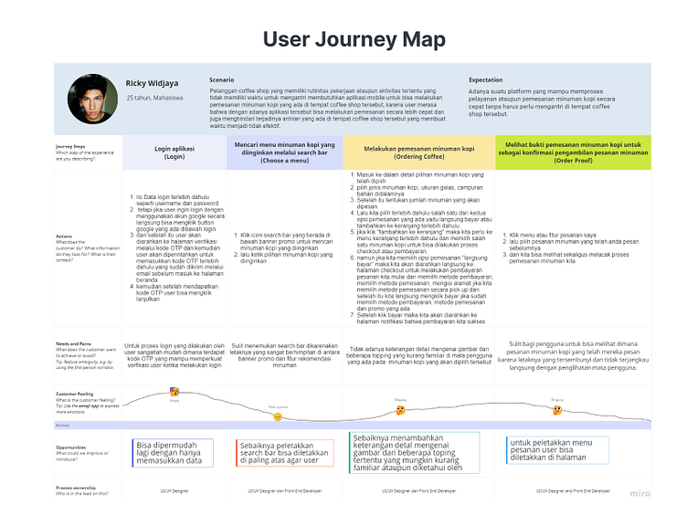
Furthermore, in this phase I determine a sample from the user population that I have previously selected through research that has been done previously with several age categories from teenagers to adults. and in this section I also create a user persona based on the user I have previously selected

3. Ideate
Then in this ideate section, I made several ideas through an information architecture, flowchart, user flow, task flow and also wireflow which I chose based on one of the tasks that will be created later. The following shows some of the flows that I made
Information Architecture
In the first part of this ideate phase, I first create an information architecture that will later be included in this Troffee application. where to make this information architecture I took some references from a comparison of existing coffee ordering applications. and the following is the result of the information architecture

Task Flow
After I made the information architecture then I made a task flow based on the information architecture that was made with reference to the user journey map that was described earlier. The following is the task flow that has been created

User Flow
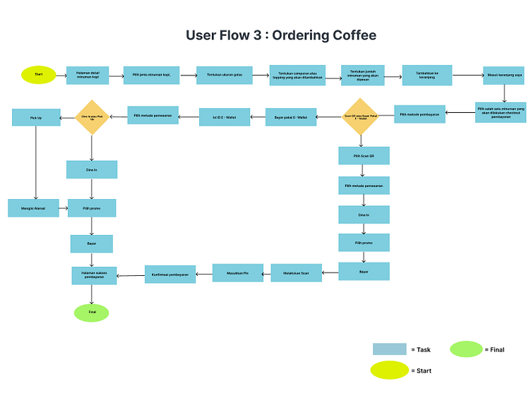
Then after I made a task flow based on one of the tasks that would later look for a solution to this user's problem when ordering coffee, then I then created a user flow based on the user's steps when ordering coffee in an application they had used before. and the following is the result of the user flow created
Flowchart
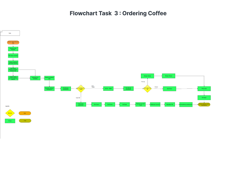
Then after that I also made a flowchart as the flow of this coffee ordering application system later when the development process is carried out. where we can find out how the flow of ordering coffee will be through this troffee application. The following is the result of the flowchart created
Wireflow
Then the final step in the ideate phase is to create a wireflow on the coffee ordering page to the payment process. where this refers to a predefined user journey map

4. Prototyping
In this phase, I started to make a Design system as a guide in making High Fidelity Designs as a result of the ideas that had been done before in the ideate phase through the wireframes that were made. The following shows several High Fidelity Designs based on wireframes made before
Design System🎨
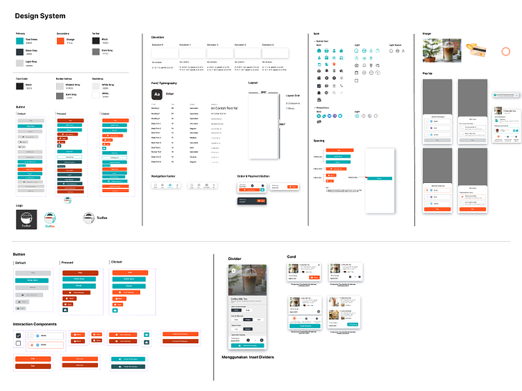
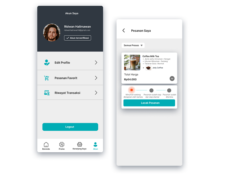
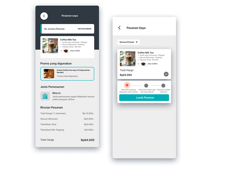
High Fidelity Design📱


Prototype📲
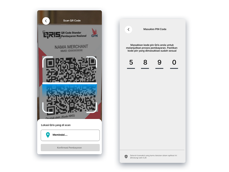
Prototype Ordering Coffee With Scan QR Code
In this application you can also order and also pay for it by using a digital wallet QR Code scan that is directly integrated with the digital wallet that you have such as QRIS. The following is the display of the payment process using a QR Code scan (QRIS)
Prototype Ordering Coffee With ID E - Wallet
Other than that if you don't have a digital wallet that can be integrated with the QR Code Scan that you currently have. You can also make payments using other digital wallets by simply entering the E-Wallet pin you choose. The following is the appearance of the application if you choose a payment method using another digital wallet besides QRIS.
5. Testing
In this section, I do testing by inviting several users to become part of the participants in testing the prototype of this coffee ordering application according to predetermined user personas, namely teenagers to adults who have an age range of 20-30 years. and the results obtained from the testing process were around 80% of participants who tried this application prototype were very satisfied with this application prototype. which according to them this application is very suitable for what is needed by them at this time when ordering coffee drinks. and the following are some of the data findings obtained during the testing process
Usability Testing
As previously explained, during the process of testing the application prototype itself through usability testing, there were several findings that I found from the interview process conducted with several users. Following are the findings that I got in the form of paint points along with room for improvement
Paint Point & Room For Improvement
The following are paint points and room for improvement obtained from several users as well as room for improvement from the feedback they gave as my guide in future redesigns
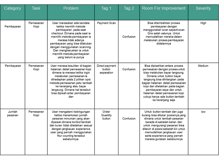
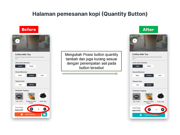
"Some users feel that the button quantity they have used for the button position to increase is usually on the right and the button to reduce is on the left"
Solution : Swap the position of the button to increase and also reduce the number of orders
"On the payment page, the user feels that there is no choice of payment method using scanning"
Solution : Adding a payment method by Scanning the QR Code
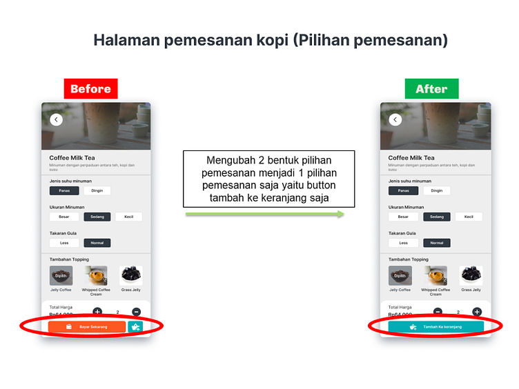
"The confusion that occurs when the user is going to place an order is that there are 2 buttons, namely the button to add to the cart and the button to pay directly"
Solution : You can only make one button option when placing an order, namely the add to cart button
Redesign (Before & After)
And after getting some pain points and also an analysis of some of the paint points in it to get room for improvement as a solution to the user's problem, I redesigned several pages according to the pain points and also the room for improvement that has been obtained.
Redesign coffee order page (Quantity Button)
The following shows the redesign before and after after making changes to the quantity button
Redesign Coffee Order Page (Add to cart button)
The following shows the redesign before and after after making changes to the Add to cart button)
Redesign payment page
The following shows the redesign before and after adding payment method options by scanning the QR code and adding the flow


Thank you for visiting my portfolio
I hope this application design can be a reference for you to be able to produce other application designs. Have a nice day..
Follow My Instagram UI/UX Design
IG : dafantastic412
