Propportunity | Perception testing
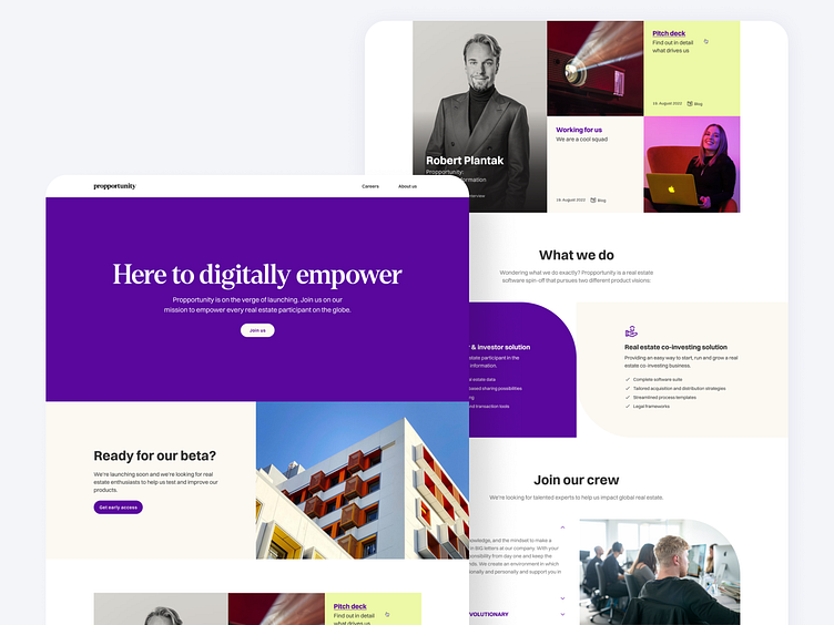
Following our initial stylescapes for our new brand Propportunity, we did further exploration focusing on the new homepage of the marketing site.
We ran a perception survey with prospective users to A/B test two different colour schemes. We wanted to understand how participants perceived the Propportunity brand, how their first impression made them feel, and discover any potential pitfalls. We also wanted to check if the user perception aligned with the values and personality we had defined for the brand.
The bright purple and green palette proved to be a winning combination, being described as bold, creative, innovative and modern, and made participants feel empowered, motivated and happy.
The perception test allowed us to move forward with a chosen direction, but this is still only the beginning! We will continue to experiment with the brand identity based on this foundation informed by our initial research. Stay tuned!


