Bateleur Magazine Layout Design
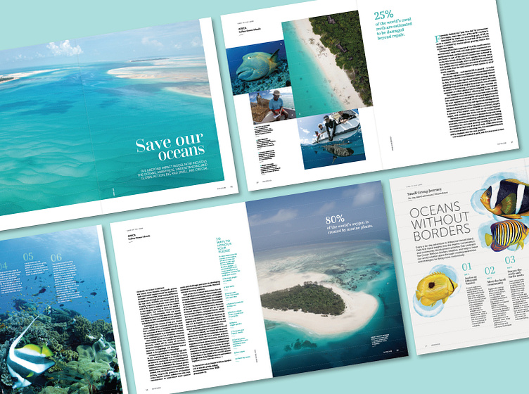
Openers always made use of the most iconic image for the article and beautifully set headlines and sub-heads along with captions and navigation.
Multiple images made use of a collage style of touching images using margins and other alignment to create dynamism and tell the story. Image selection was carefully curated to emphasise the colour palette.
Large areas of white space and printing on an uncoated stock elevated this collectible coffee table magazine.
The layout of facts and figures were guided by the image selection and grid.
The country colour was reinforced throughout the article by the photographic and illustration choices as well as the highlighting of sections of copy in colour.
Small group journeys were easily identified through the magazine by their pale grey backgrounds, large illustrations, itinerary layout, map and right edge detail.


