Rental car App
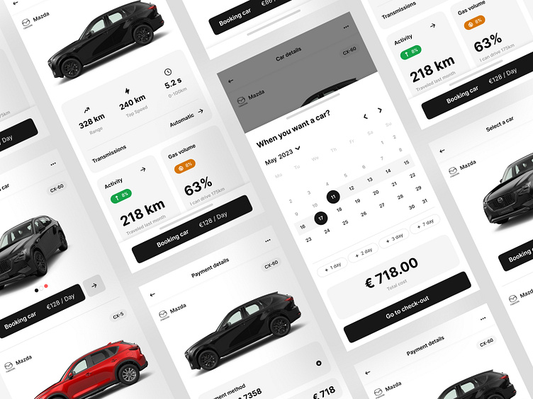
The UI/UX design for a rental car application features four screens that prioritize user experience and exude a premium and modern aesthetic.
The first screen presents users with a range of car options, displayed in an elegant and visually-appealing manner, while the second screen provides comprehensive details about the selected car in a clean and sophisticated layout. The third screen enables users to choose effortlessly their desired rental dates, and the final screen boasts a polished and streamlined payment confirmation process. Overall, the premium look and feel of the application elevates the user experience and sets it apart from competitors in the market.
As a designer, I am always open to collaborating with new clients to create beautiful and user-friendly designs for their applications or websites. Please feel free to contact me to discuss any potential design projects you may have.


