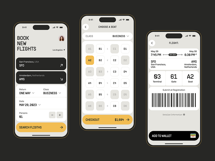
Flight Booking Mobile App UI UX Design
When our team was approached by the clients who wanted to launch their flight booking app, we were thrilled to take on the challenge.
A top priority was to make the app easy to use since searching for flights and planning a journey can be overwhelming tasks. We chose a calm orange color palette with hints of gray and black to create a simple yet captivating design. Our objective was to provide users with an environment where they could concentrate on the task at hand without being distracted by unnecessary design elements.
Our ultimate goal was to deliver a smooth and seamless user experience, and we accomplished this by making the app's navigation effortless and ensuring it provided all the essential information without clutter.
Let's collaborate!
hi@conceptzilla.com
Discover more about us at conceptzilla.com
