YouTube Redesign


Howdy Dribbblers,
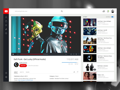
This is my "YouTube vision" of the video page.
The full view attached is available in normal and retina with sidebar enabled/disabled.
Here below you can find some key-thoughts:
● The whole structure is optimized for watching and search the video, exploring all the related videos too. Simply put, it fulfills the purpose of the YouTube video page; it seems essential to maintain a balanced and intuitive user-interaction.
● The left sidebar panel is designed to auto-collapse in order provide users with a permanent visible and direct way of locating their navigation bar.
● The video player bar is simplified, distributing all the features within the same line, in order to make its use immediate and smooth. I can't determine if it is a "better solution" than the current well-thought-out YouTube video player (I haven't any data); but I'd like to test something ui-related with this level of visual organization.
● A general improvement of the visual hierarchy should helps the user to explore each item of information in a more clear and easy way.
---
The YouTube redesign was done for fun, practice and visual study purposes only and is not intended to be implemented.