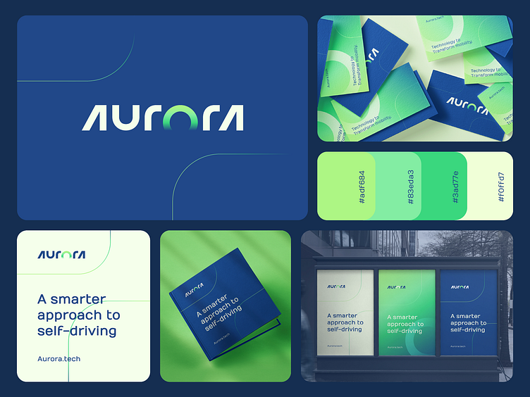
Aurora Reabranding Concept
Rebranding proposal for Aurora.
The new proposed visual identity embodies modernity, boldness, and a futuristic feel. The logo is a cleverly designed logotype, with the letter 'o' taking on the shape of an Aurora ring. The use of the green gradient color combination in the logo adds to the sense of innovation and cutting-edge technology.
The logo's boldness is immediately apparent, with its crisp and clear lines that convey strength and confidence. The dynamic design of the logo captures the forward-thinking approach of Aurora.tech, reflecting the company's commitment to progress and innovation.
The futuristic look of the logo speaks to Aurora.tech's vision of being at the forefront of the technological revolution, constantly pushing the boundaries of what is possible. Overall, the logo is a striking visual representation of the company's values and aspirations, conveying a sense of energy and purpose that is sure to captivate audiences and set the brand apart in the marketplace.
Looking for a creative partner for your next big idea?
If you think I can help you get in touch
getahmed5@gmail.com
