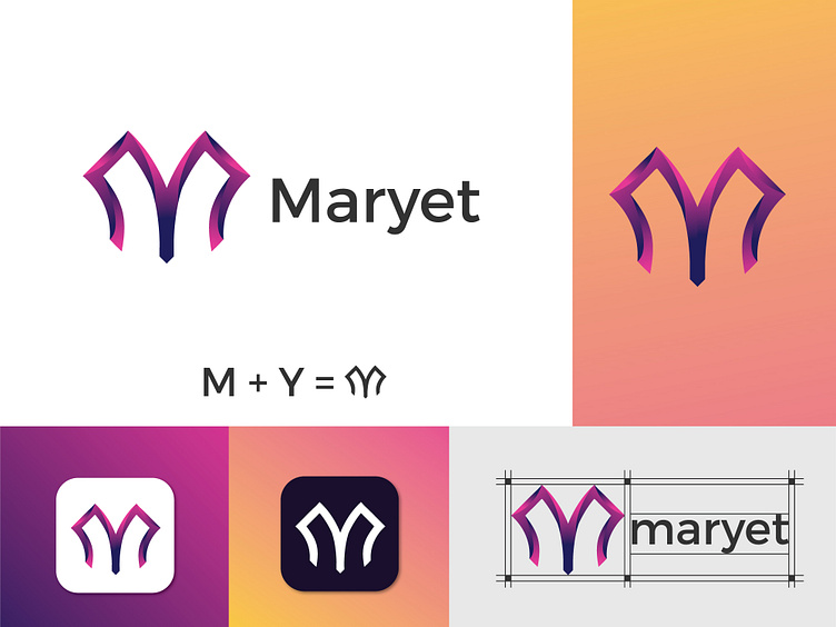
logo design letter MY brand identity
Hello, There
After a thorough brainstorming session, I sketched out several ideas and finally came up with a concept that perfectly captured the essence of the brand. The logo design features a stylized "M" and "Y" interlocking to create a beautiful and elegant shape.
The colors chosen were a subtle combination of blue and grey, which perfectly complement each other and convey a sense of professionalism and sophistication.
The end result was a logo that my client would absolutely love and would be thrilled to use for his company's branding. The logo perfectly captures the essence of the brand and will become a symbol of recognition for his company. I am delighted to create something that my client is proud of and that perfectly represents his brand identity.
I would love to hear your feedback on this design. Let me know your thoughts about this logo in the comments.
Don't forget to Press 🧡 if you like it!
This logo is unused. Available for sale
(Unused Concepts)
Get in touch with me:
WHATSAPP | BEHANCE | LINKEDIN | INSTAGRAM
Email- monmohonpk@gmail.com
Regards
