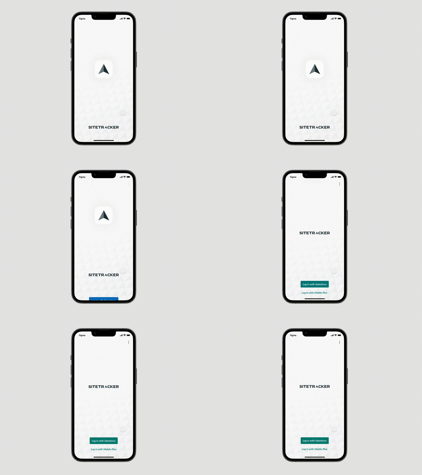
Updated log-in screen
Sitetracker recently went through a rebrand and they needed to update the login screen of their mobile app to be in alignment with the new brand direction. I wanted to add motion that captured the feeling of progress that the arrow icon represents. That also matches the Sitetracker's value of making our world more connected and sustainable.
More by Seth Richardson View profile
Like
