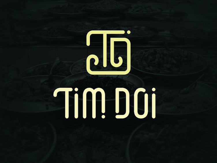
Brand Identity: Tim Doi logo
And we come to our final logo. Overall, I was extremely happy with how this turned out. There is a definite harmony between the spacing and geometry of the mark itself which is complimented by the typeface.
Thanks to @Cameron Miller for creating the entire Tim Doi alphabet - hopefully, he'll post it later today.
More by Bakery Agency View profile
Like

