Charcuteria Romana
Project Components: Branding · Packaging · Website · Social Media
Charcutería Romana
Charcutería Romana is not just a company; it's a story - a tale of immigrants who stumbled upon a delicious yet small gap in the Dominican marketplace. And in that gap, they saw an opportunity to create something unique - artisanal sausages and sauces with unmatched flavors. Their passion for their craft is evident in every bite, and their dedication to quality and tradition sets them apart. They didn't just start a business; they started a journey that continues to bring joy to countless taste buds today.
Have you ever wondered why not make something yourself instead of always buying it? That's precisely what the founders of Charcutería Romana pondered. They turned their love and passion for cured meats into a business so they could share their unique flavors with the world. And now, they're doing just that.
Challenge
Our challenge was to bring this concept to life in a visually stunning manner - one that's well thought out and developed yet easy for consumers to identify. We wanted to communicate a fresh, clean, professional brand while retaining that artisanal touch that sets it apart. How did we meet this challenge? With creativity, precision, and an unwavering commitment to excellence. The result is a captivating and trustworthy brand designed to inspire and delight.
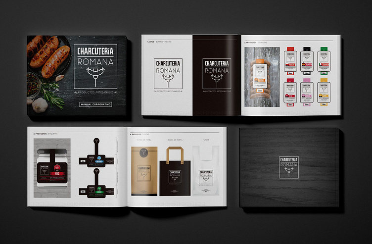
Logo Design
To represent a company at both national and international levels, the first step we took was creating a logo. This logo was expected to embody the meaning of our brand and convey the idea of high-quality and artisanal products that adhere to the standards set by health authorities. We aimed to instill a sense of trust in consumers at first glance, making them feel confident in purchasing our products.
After conducting extensive customer research, we discovered that its product was primarily used for family barbecues and grill-outs. Thus, a logo needed to convey this message through creative graphics effectively.
After careful consideration, we opted to use one of the most beloved tools in the kitchen for this endeavor. The shining star product we hope to introduce and make known is proudly positioned atop the gadget.
When it comes to branding, less is often more. That's why we put our skills to work and applied a simple, clean, and well-designed style to ensure a brand stands out across all media. By removing unnecessary fluff, the brand can shine and make a lasting impression on your target audience.

Font Selection
The Brown
It was time to choose the font that would complement the graphic work. We decided on tall and thin typography with an antique style, featuring a slight variation in the horizontal lines at a 45-degree angle, giving it its unique personality.
Panama - Light
As our second source, equally important, we opted for the Light version of this font. Not only does it maintain the established style, but it also features a beautiful curvature in its horizontal lines, giving it a unique flair.

Color Palette
It was time to choose the color scheme for the brand, and after many tests and sketches, we decided to use the timeless combination of black and white. By avoiding the use of color in the brand, we could convey a sense of old-world artistry and craftsmanship more directly. It allows us to play with color when creating graphic images for each product.
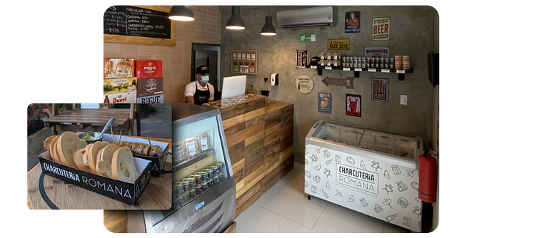
Packaging
Creating a striking image for the products was crucial to stand out from the competition. It would ensure that loyal customers could quickly identify them. In contrast, new customers would find them irresistibly attractive and decide to make a purchase. We've developed a captivating brand image that will leave a lasting impression on its customers.
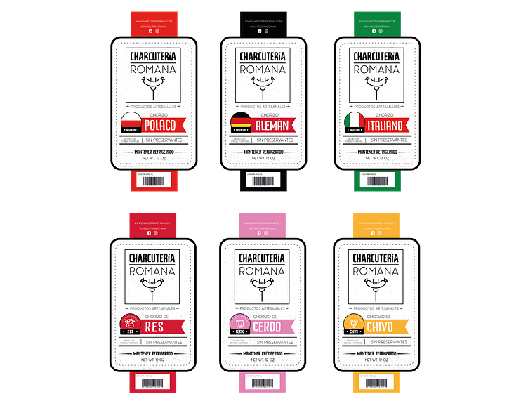
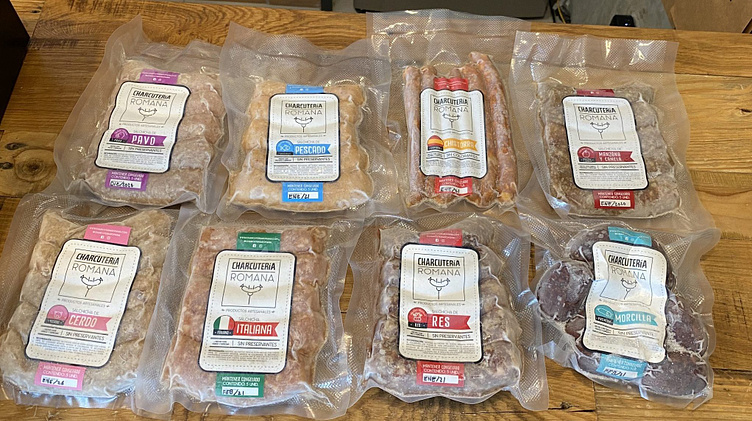
Sausages
Picture this: you're strolling through the grocery store, and your eyes fall on a pack of sausages. They look juicy and tasty. But wait, what's in them? How do you cook them? Fear not, because every package of links needs packaging that gives you all the info you need without getting in the way of what's important: the product itself.
As we wanted to showcase the different available flavors of sausages, the design had to be transparent, with enough space for information and colors representing each flavor. Please, keep reading to discover our mouth-watering options!
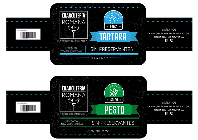
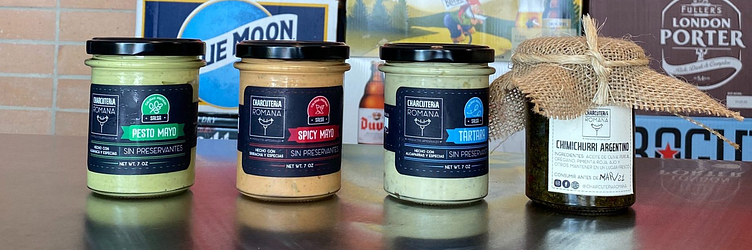
Sauces
When it comes to sauces, showcasing their texture and color is just as crucial as with sausages. That's why we've opted for glass containers. Doing so lets you display the freshness of products and reassure customers they're getting a top-quality, ready-to-eat sauce.
Have you ever wondered how to differentiate between different flavors of sauces? Well, this brand has got it covered! Following the principle of sausages, we have decided to assign specific colors to each sauce flavor for easy identification. Savor the taste without any confusion.
Website
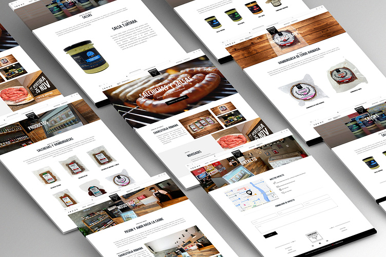
After developing the brand, it was time to introduce these products to the world. Our solution was to create a website where customers could easily access and order every product the company offers. We designed a simple and intuitive interface with an enjoyable user experience, making navigation between tabs a breeze. Customers can easily explore and request what they need with just a few clicks.
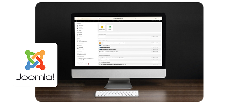
Joomla! CMS
As we built this website, having a user-friendly content management system with all the necessary features was paramount to its success.
This is where Joomla comes in—an easy-to-use, interactive content management system with all the necessary plugins to ensure the site runs smoothly.
Main Components
· SP Page Builder
· J2Store - Forms
· Smart Slider 3
· Google Maps Integration
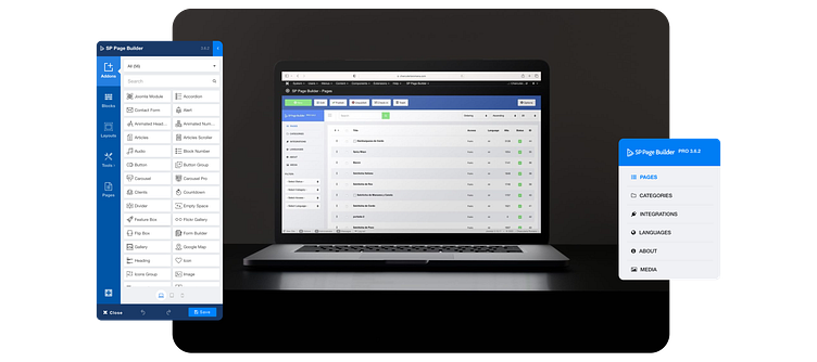
SP Page Builder
As one of Joomla's leading builders, SP Page Builder was a crucial tool for designing and styling all necessary pages. Its versatility and ease of use made it an indispensable asset to our website development process. With SP Page Builder, we were able to create captivating and professional-looking pages with minimal effort.
An easily updatable and user-friendly interface on a website has allowed us to seamlessly integrate all necessary features to provide each user with the best possible experience. Our focus on ensuring effortless maintenance means that your experience with us will always be top-notch.
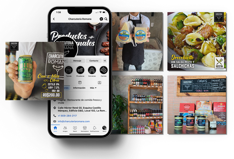
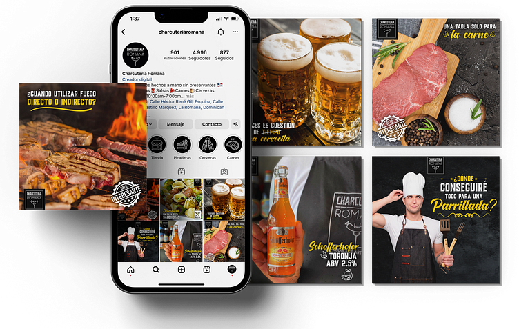
Social Media
When we set out to promote this brand, it wasn't just about selling its product. We wanted people to understand the benefits of consuming 100% natural products. So, we took to the digital world, positioning Charcurtería Romana across various platforms to share nutritional information, tips, and precautions for using its product.
With Instagram, we built a community where we cleared up all of the brand's clients' doubts, providing them with personalized and direct attention.
Have you ever wanted to easily browse and explore all of your favorite brand's products? Well, now you can! With their digital catalog, clients can access all unique offerings at the click of a button. So, goodbye to frustration and hello to a streamlined shopping experience.
On Facebook, we utilize the platform's tools, such as the Marketplace and Facebook Ads, to position the brand nationally and internationally.
Our targeted and objective-driven campaigns allowed us to reach the specific audience we aimed to connect with.