Case Study: Bartender School Website
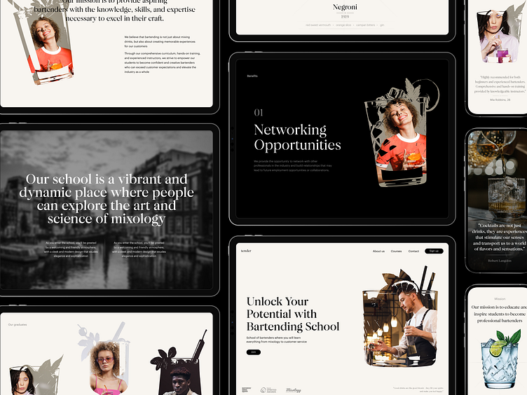
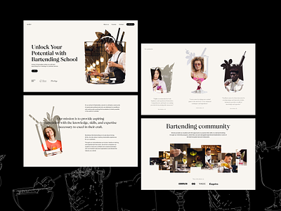
Sip some elegance and style with our new web design project. Take a deeper glance at the website for the bartending school and courses for those who strive for knowledge and practice in the sphere.
Elegant layout playing with typographic hierarchy, contrast and negative space, well-arranged theme photo and video content, smooth motion, custom graphics and cool trendy mask shapes of glasses together make the pages not only informative but also eye-pleasing and emotional.
If you want to collaborate, contact us via hire@tubikstudio.com
More by tubik View profile
Like


