"s" vector process
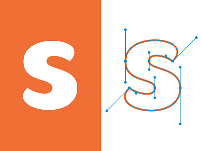
For all you type nerd vector heads, I thought I'd share a process shot of an "S" I designed as part of a lettered logo I'm currently working on.
It's one thing being able to illustrate a balanced "S" but for all those that have tried, vectoring an S can be a real tug of war between anchor points, trying to achieve that balanced form without any unsightly kinks.
It's not hard at all to waste hours on this letter.