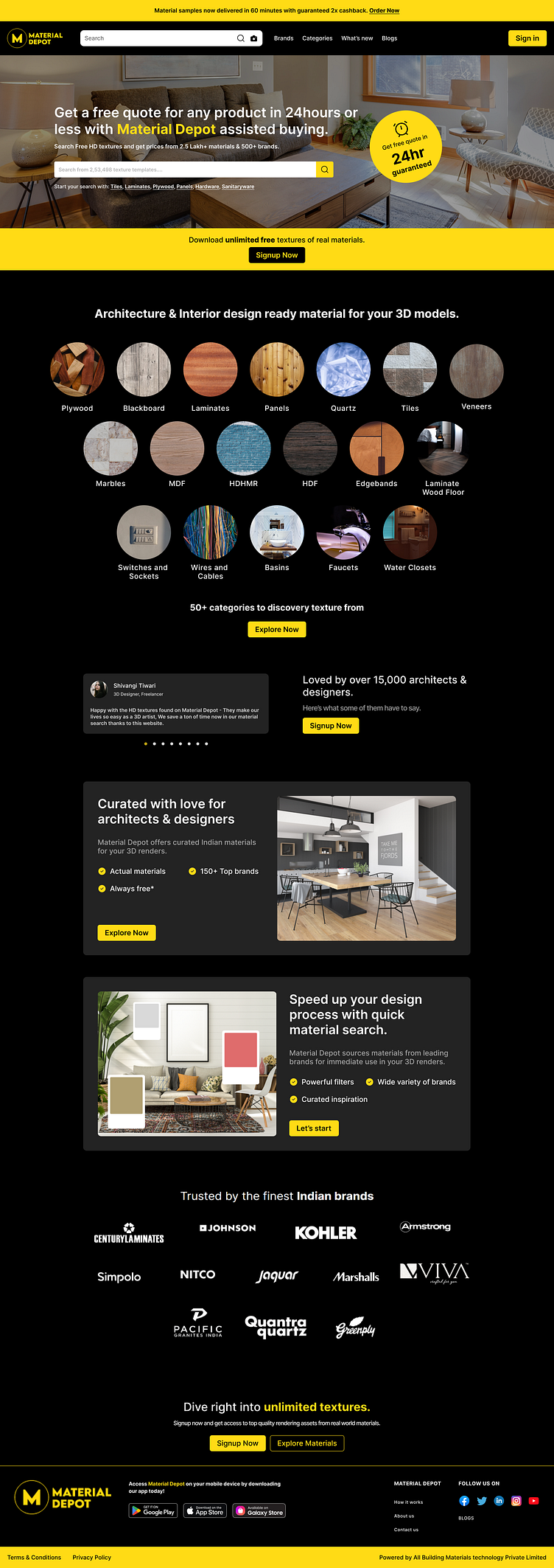
Material Depot Comparision
Including the original landing page of the company so that you can understand the reason behind the redesign and the need for improvements.
Also sharing the link of the same - https://materialdepot.in/
Comparision - Original vs Redesign
Header
The header section had multiple visibility issues such as small text, logos, and CTAs. It was challenging to determine the purpose of the website from the headline.
Inconsistent Elements
The grid for product categories was inconsistent, cluttered, and not aligned properly. The same issue existed with the CTA button that was placed below it.
Do I need to say more about this?
The visibility issues included text that was too close to bullet points, small text, unaligned elements, lack of hierarchy, and inconsistent padding.
Footer
The CTAs were improved in terms of hierarchy and contrast.
In conclusion
My goal was to create a clean and visually appealing website, but I also took into consideration the impact of pure black on users' eyes. To address this, I included an alternative color (#121212) to improve accessibility and reduce eye strain.
You can access it here - https://dribbble.com/shots/21416619-Material-Depot-Redesign
Thank you for taking the time to review the website redesign. I would greatly appreciate any feedback you have on the overall design and improvements made.


