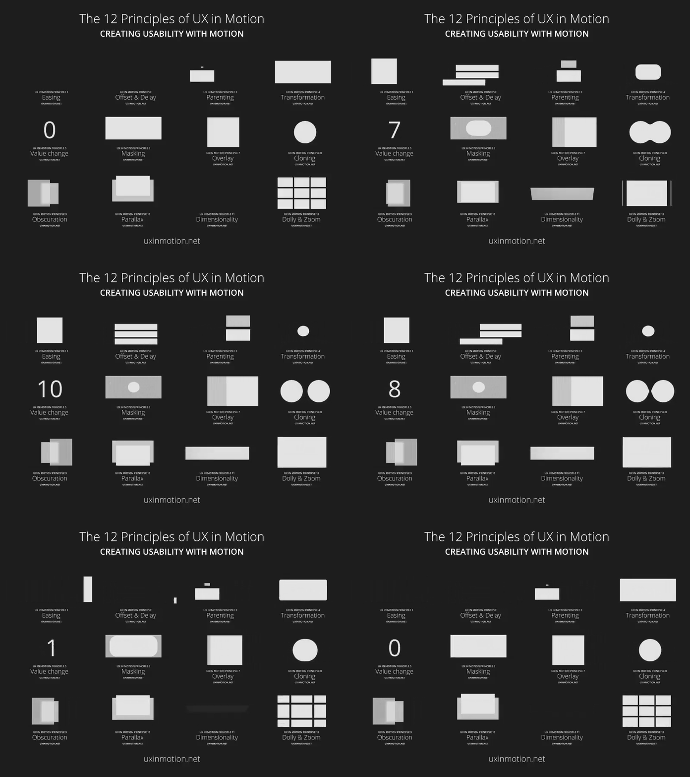
The 12 Principle of UX in Motion
1. Easing
Easing mimics how real-world objects are accelerate into speed and slow down over time.
Solution : Implement real-world accelerate principle into elements for smooth experience.
2. Offset and Delay
When several UI elements is moving in one page , users tend to..
Group all info together since it is in one page resulting in overlooking the possibilities of what each section has to offer which is different from other sections.
Don't understand the section dividation and where to start.
Solution: Moving into one by one UI elements of the page to represent and show the different parts to consider & the hierarchy to follow.
The main difference between Offset and Delay & Parallax is one move all UI at the same time and other moves one by one in different time to shows elements.
3. Parallax
Parallax is displayed when two or more UI elements move at the same time but at different speeds.
Move faster: Most important hierarchy element.
Move slower: second least.
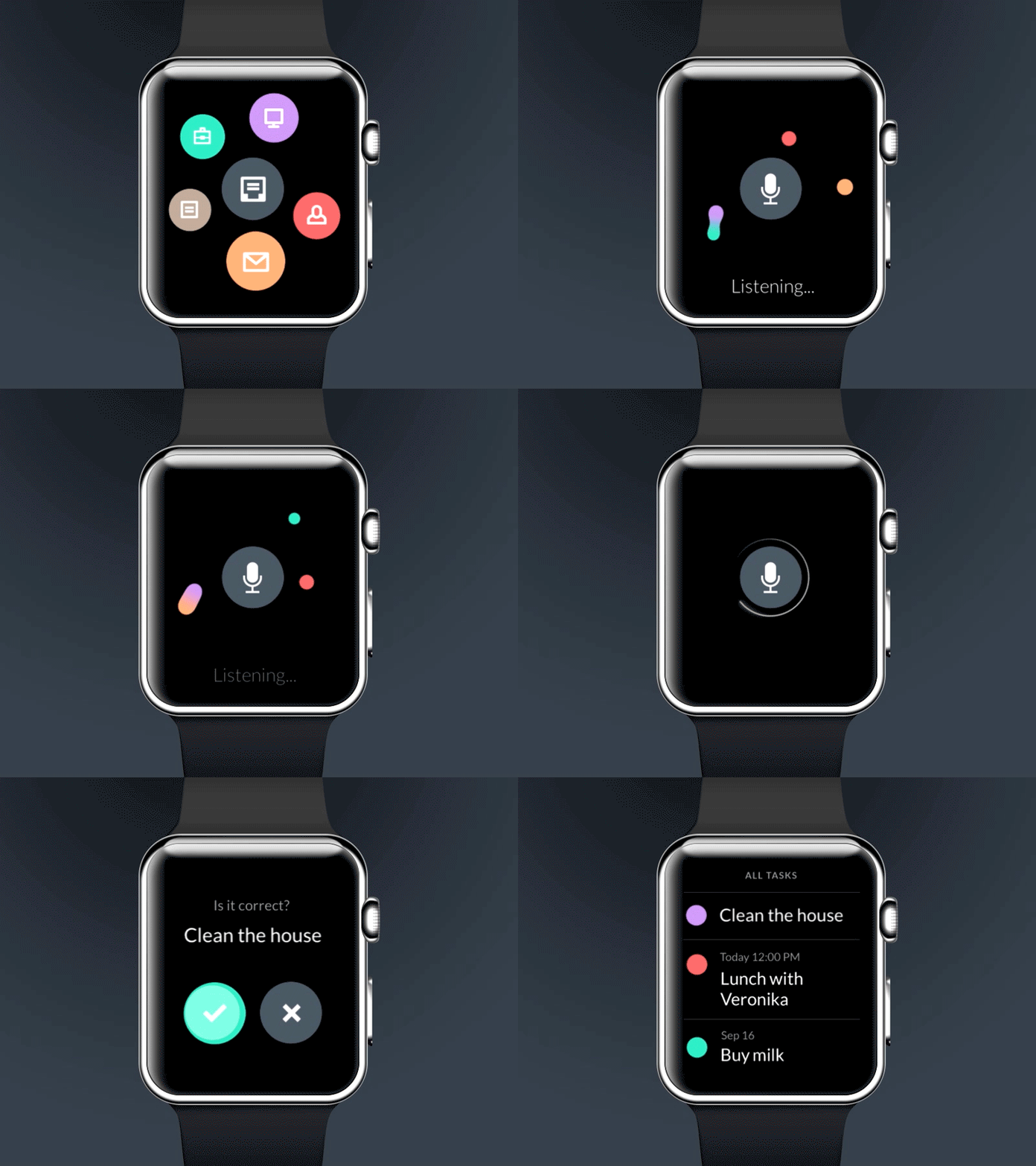
4. Parenting
Linking two or more related parent & child objects together to create a complete experience.
Solution: This creates object relationships and hierarchies in ways that support usability.
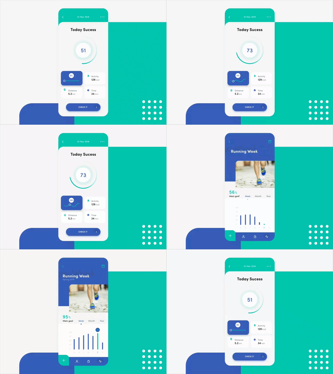
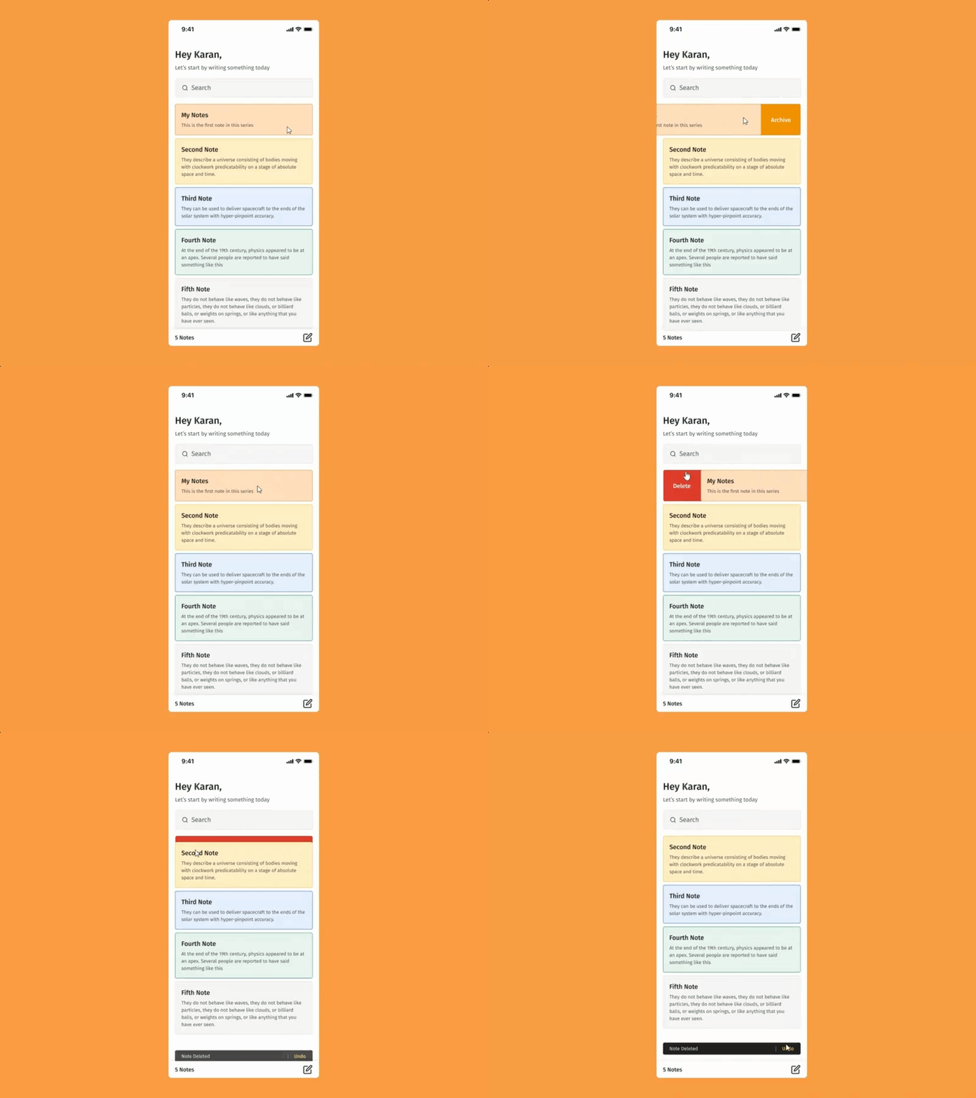
5. Principle of Transformation
Transformation occurs when one UI element turns into another.
Solution: Transformation is an effective way to show users their status toward a goal.
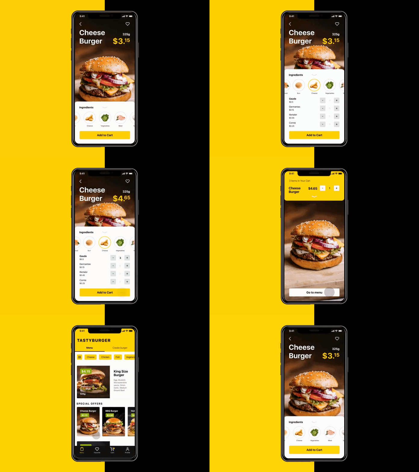
6. Value Change
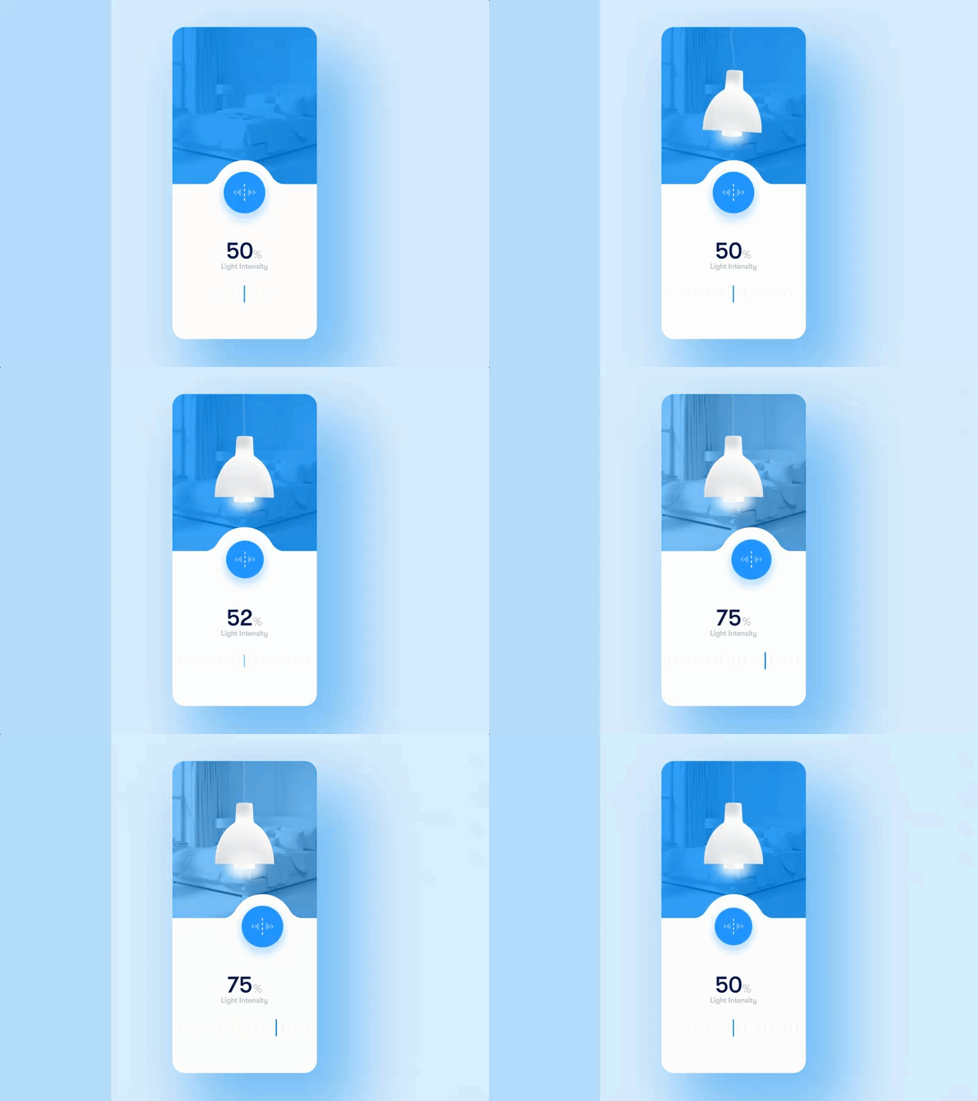
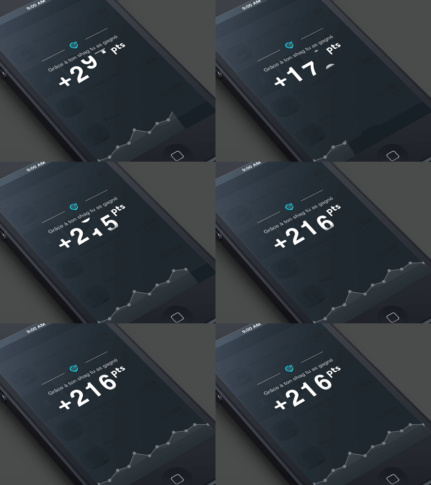
Ui element that changes its value real-time or manually.
The numbers and values are representations of things that are happening in real-time.
In real time events, such as loaders and transitions, the values change without user input which is through motion to reflect a dynamic narrative.
In non-real time events, the user is interacting with the objects to change values.
Solution: Data Visualizing of time, income, game scores, business metrics, fitness tracking, etc.
Value change is basically Data visualization.
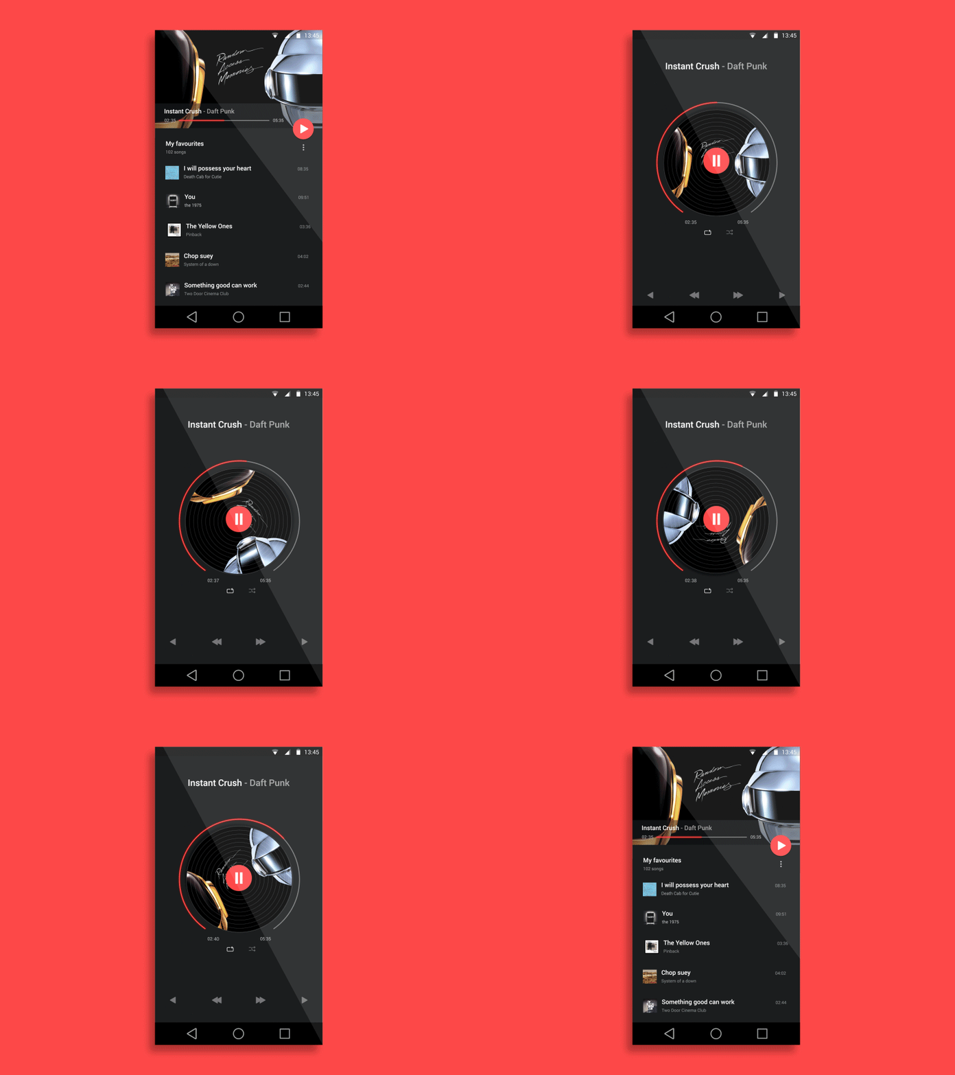
7. Masking
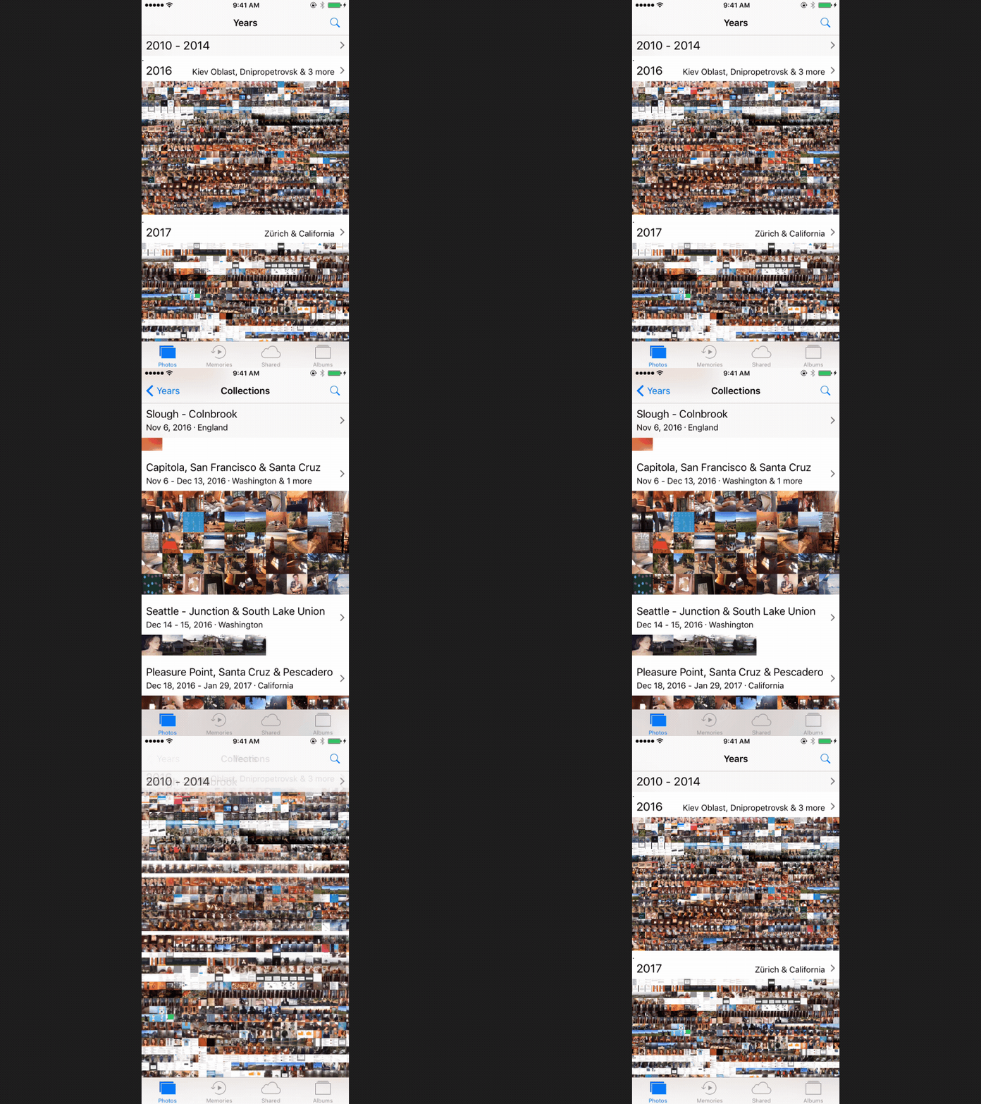
Creates continuity & reveal full width in one interface object when the interface is clicked by which part of the object or group is revealed or continued
Solution: revealing continuity of an element when clicked like music progress.
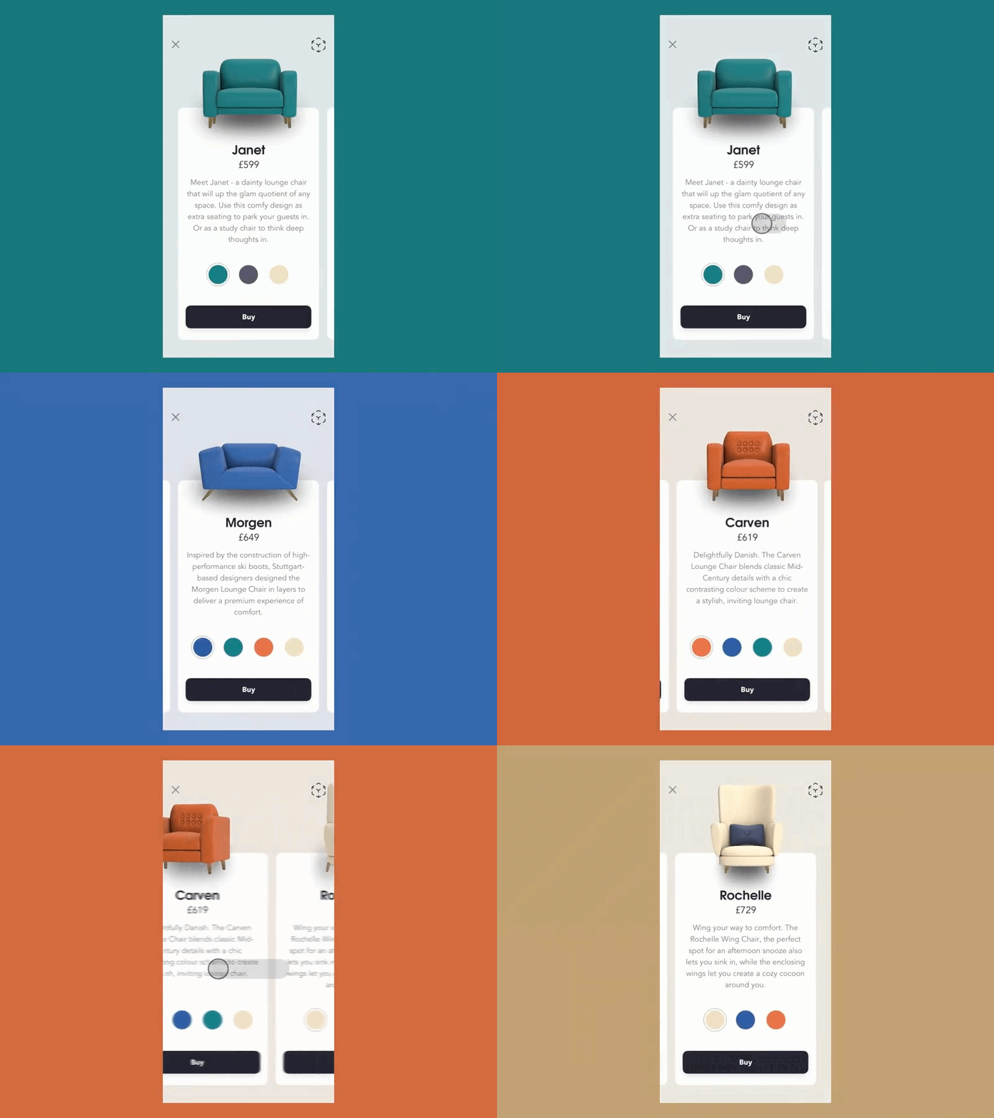
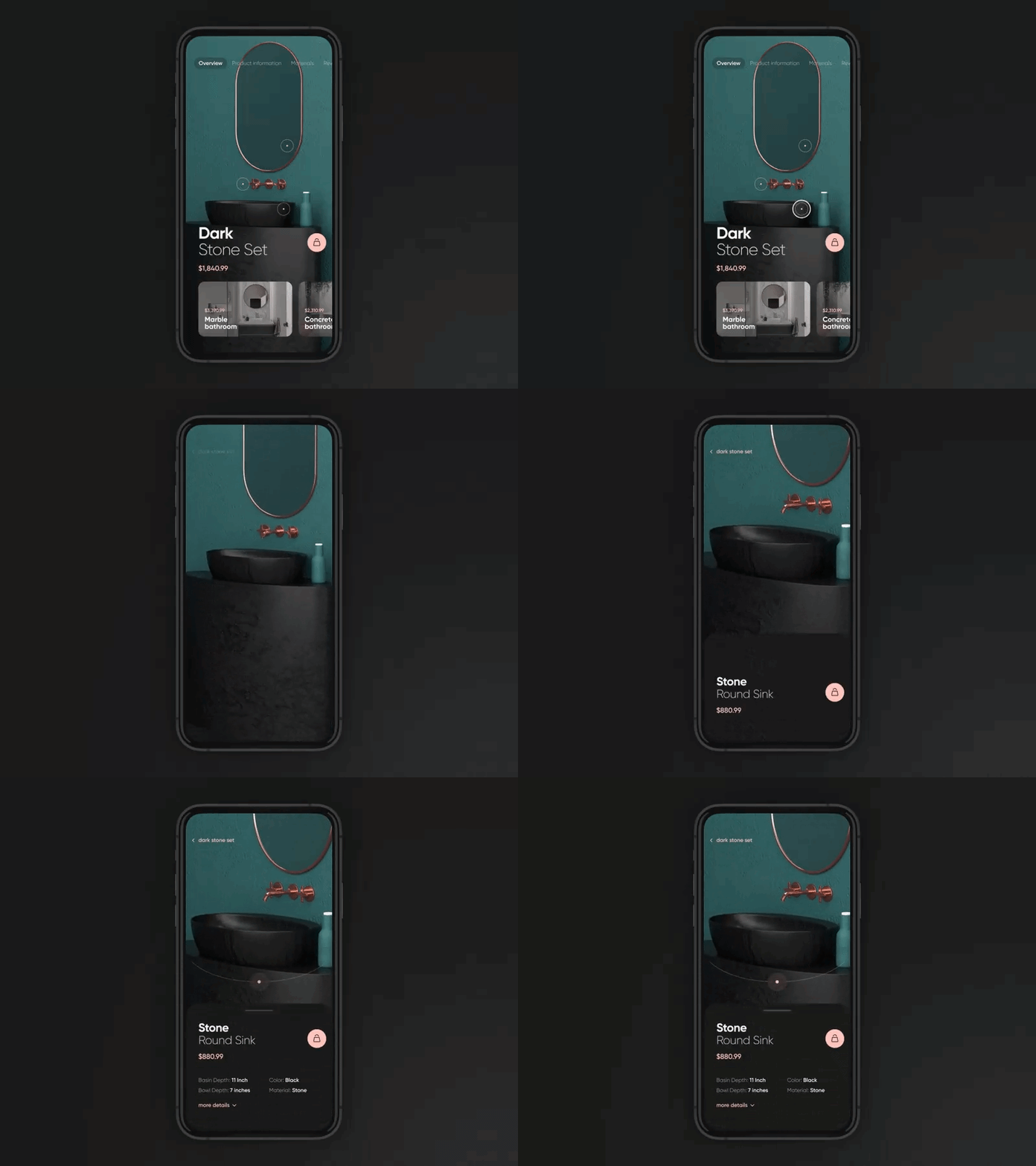
8. Dolly and Zoom
Filmic concepts referring to the movement of objects relevant to the camera, and the size of the image itself in the frame smoothly changing from a long shot to a close up shot
Solution: Allow users to “travel” through UI elements spatially or increase their scale to reveal greater levels of detail.
The main difference between Masking & Dolly and Zoom is
one reveal the continuity of only one element and other reveal the continuity of multiple elements to travel through.
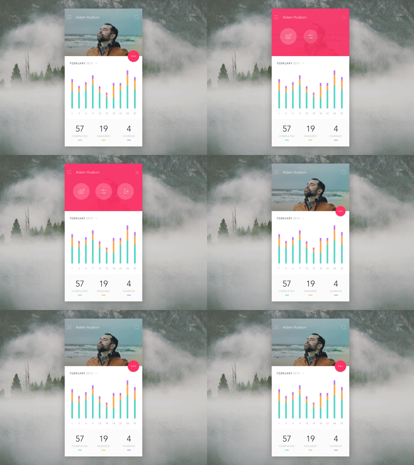
9. Overlay
Design with layers of one element which reveal more options for that particular element.
Solution: When Click option is slide and the concept of layers are deeply internalized which reveal internal clickable options.
10. Obscuration
An interface that simultaneously revealing a hint to follow as a (pop-up) to complete the action.
Solution : revealing simultaneous popup screens of related elements.
11. Cloning
Cloning is a motion behaviour where one UI element splits off into others.
Solution : Creating new objects from existing hero objects during the time the user’s attention is focused on those objects.
12. Dimensionally
Dimensionality makes it seem as though UI elements have multiple interactive sides.
Thanks for talking your valuable time to read.
I have planned to produce curated valuable 1 content a week in UX-UI design. If you finds it valuable, sure enough you will love my future content too.
Consider giving me a follow for more, won't cost nothing!
Stay Hungry, Stay Blessed.
:)
