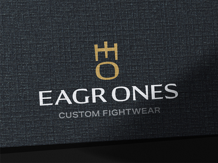
Eagr Ones logo design & brand identity design
Founder of well established custom-design fightwear brand, Eagr Ones, Edgar Llamas felt his current logo was a little tricky to understand at first glance and didn’t have enough meaning behind it. Edgar wanted a new logo and identity that he could be proud of and embodied the trustworthy and reliable reputation he’s built over the years - without sacrificing on approachability.
As with all of my identity projects, I started out with my research. After analysing different brands within the space, it became clear that most competitors use black and red with aggressively bold typefaces. Being a designer himself, Edgar came with many fantastic thought starters of how to differentiate the brand which I gave significant consideration to throughout my process.
During my initial ideas stage, I was trying to find unique ways of combining an E with the number 1. I came up with a really sweet lock up where the E and 1 made a lightning bolt, signifying energy. However, I concluded that the viewer would read the lightning bolt first rather than the E so I paused on this concept. Then I started to come up with ideas combining an E and an O (instead of the number) which was very fruitful. I rotated the letterforms so I could work on symmetry and eureka! This is when I started getting super excited about this direction.
With this design, I was able to add so much meaning; stylistically, it is rooted in Japanese culture nodding to the origin of Jiu Jitsu which Edgar practises regularly. Also present in the top section of the logomark is the number 18 in Japanese Kanji representing the year the brand launched (and the year Edgar had his first son). This section also translates to ‘mountain’ in traditional Japanese signifying the goals martial arts practitioners aim to reach. Furthermore, this same top section of the logomark abstractly symbolises a crown, indicating Eagr Ones’ premium quality product offering. The circular shape underneath brings with it the feeling of unity and the world. Finally, when the logomark is turned on its side, it reads ‘EO’, the initials of Eagr Ones. This was a HUGE win as this mark brought so much meaning with it, I was so stoked!
Edgar also mentioned in his brief that he loved subtle serif typefaces which I wanted to indulge in the logotype. After selecting a beautiful typeface and making some adjustments, I reformatted the logomark to fit alongside, creating true cohesion between the two elements. Finalising the identity with various different logo variations and an elegant but durable colour palette, we were good to go!
Ready to create or refresh your brand's identity?


