Input Field - Horizontal Label
Input Field Component
The Input Field Component is a reusable UI element that provides a way for users to enter text or data into a form. The component supports multiple variants and states to suit a variety of use cases.
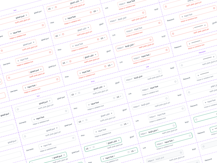
Variants
The Input Field Component supports the following variants:
Text Field: This variant is used for general text inputs.
Price: This variant is used to input a numeric value, such as a currency amount.
Phone: This variant is used to input a phone number.
Password: This variant is used to input a password or other sensitive information.
Link: This variant is used to input a URL or web address.
States
The Input Field Component supports the following states:
Default: This is the default state of the input field, with no specific styling or behavior applied.
Focus: This state is activated when the input field is selected or focused by the user. It typically includes a visual indicator, such as a border or highlight, to show that the field is active.
Disabled: This state is activated when the input field is disabled and cannot be used by the user. It typically includes a visual indicator, such as a grayed-out appearance, to show that the field is disabled.
Filled: This state is activated when the input field has a value entered by the user. It typically includes a visual indicator, such as a checkmark or other icon, to show that the field has been filled.
Error: This state is activated when there is an error with the input field, such as an invalid entry or missing information. It typically includes a visual indicator, such as a red border or warning message, to alert the user to the error.
Features
The Input Field Component includes the following features:
Auto-Sizing: it is designed to automatically adjust their size based on the length of the input text.
Placeholder Text: Placeholder text can be used to provide guidance on the expected input format or to display example input.
Internationalization: It is designed to support RTL and LTR languages.
Styling and Theming: it is designed to be consistent with the overall design system, including support for custom styling and theming.
Spacing and Layout
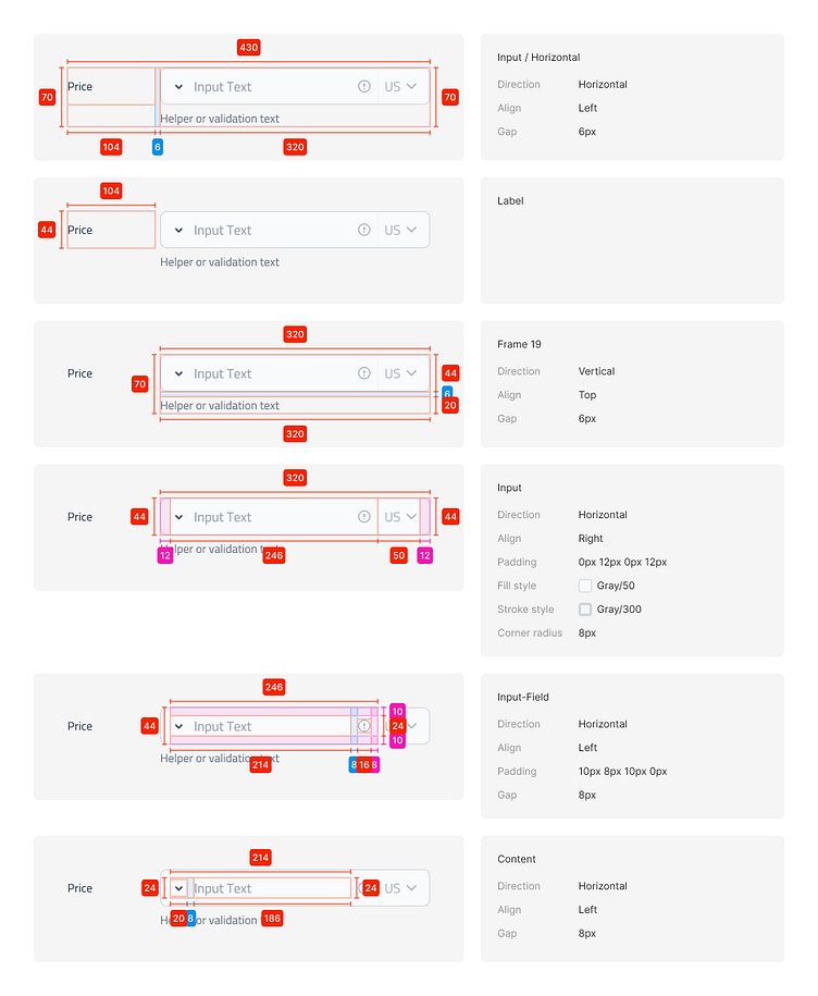
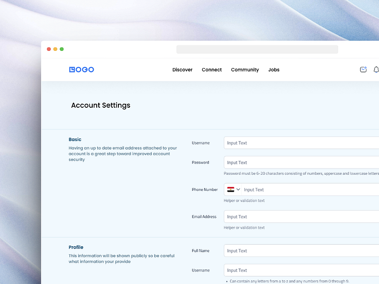
Example
Stay tuned for more shots! 👋🏻
---------------------------------------
Do you have a project you’d like to collaborate on?
Let’s talk about it at karimemad167@gmail.com
Want to see more in the future? Don't miss any of my shots and
