Portfolio Home
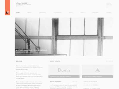
A new layout with an alternative color scheme. I found the last option worked well on smaller screens but was almost too short on larger screens. There is less updates by one to allow for some introductory text. The main image is a place-holder for now.
I'm thinking about going for this version before I change my mind again :^)
More by Helvetic Brands® View profile
Like


