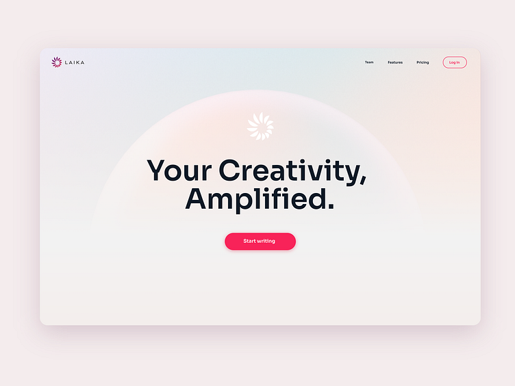
Write with Laika
Laika is an AI-assisted tool for authors that helps stimulate creativity in a fun setting. Users can write text into an editor and can - whenever they want - have AI-generated text snippets inserted. The unique idea of Laika is that users can choose from a ready-made set of "brains" that write in the style of famous authors, or even upload their own texts to train the AI, which then imitates the desired style.
Services: UX Research | UI/UX Design | Branding | Web app development (React.js)
The Challenge
The primary challenge was to create a seamless and intuitive experience that makes the collaborative writing process with AI easy and accessible. We aimed to create an app that was simpler and more user-friendly than other AI products on the market. Designing an intuitive interface that minimized the learning curve, provided clear guidance, and made the AI features easily discoverable was crucial.
The Solution
We created a clean and minimalistic user interface that placed emphasis on the core writing experience. The text editor was designed to provide a distraction-free environment, with AI-assisted features like text, image, and character generation subtly integrated into the interface. We also added clear visual cues and tooltips to guide users in discovering and utilizing the AI functionalities. To empower users to experiment with AI-generated content, we implemented clear undo/redo functionality and the possibility to alternate between three generated text snippets.
We wanted to make brain generation and management effortless, giving users the power to create their own brains and discover new ones, so we built a dedicated page that acts as a "marketplace" for brains. Here, users can easily upvote, downvote, or save brains to their personal library and have them ready to use in the text editor whenever they need them. Users can also train their own brains and share them to the marketplace. To make brain training a user-friendly experience, we split the process into four easy steps.
We worked closely together with our client and put a lot of thought into the design to create an experience that felt like pure magic.
---
Thanks for watching!
Have a project idea in mind? See more of our work here and contact us at info@vanilla-noir.com


