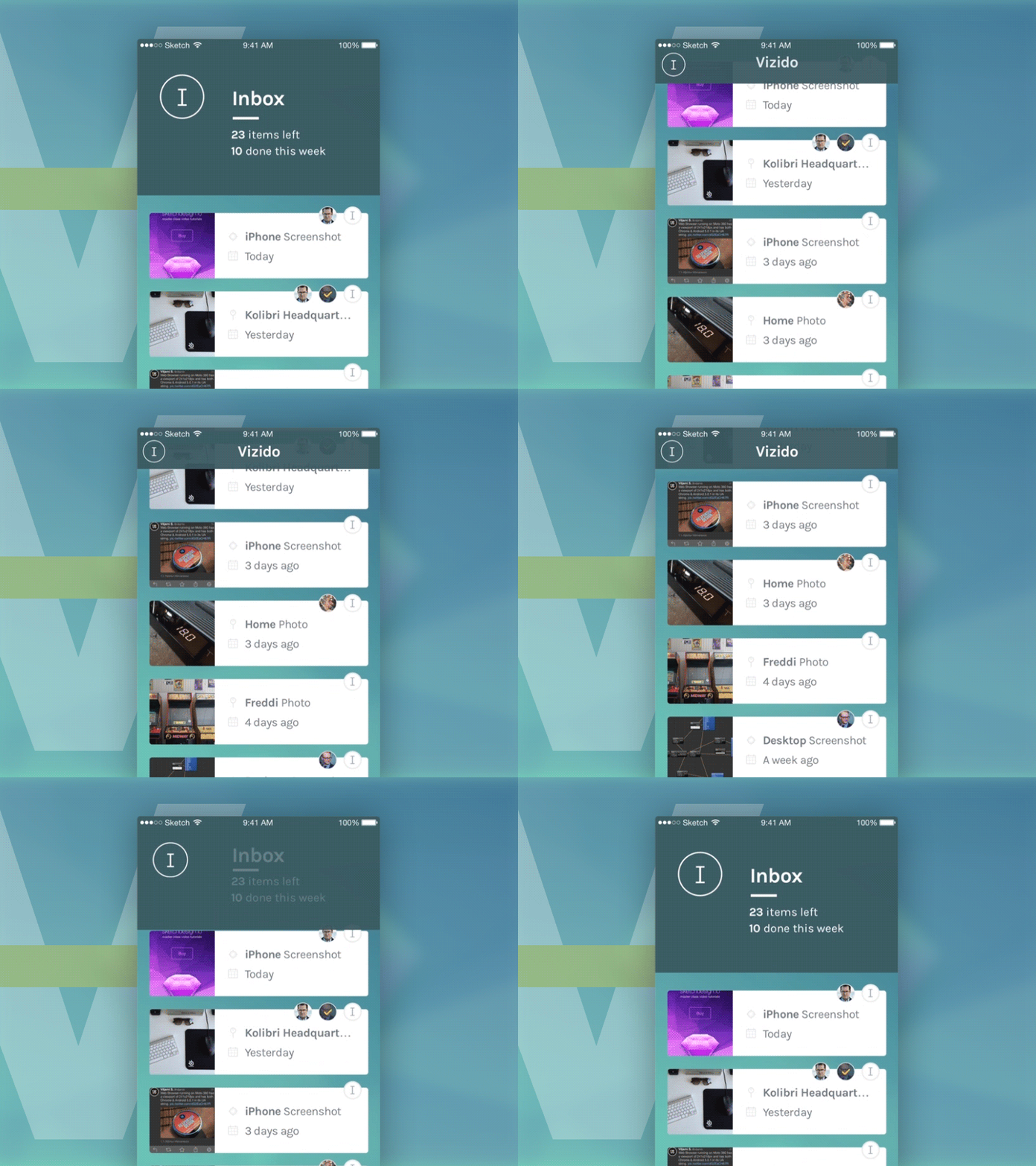
Vizido Header Transition GIF
View attachments for full pixel design and HQ video.
I'm finally getting the chance to make HiFi prototypes after going through some testing and a few stages UI and UX iterations.
The main feed header is intentionally left large in the initial state (thumb reachable for navigation purposes – which we'll demo later) but when scrolling through the feed it shrinks to a more familiar size while keeping the feed letter visible (the 'I' in the circle). The app name also becomes visible when scrolling but this may get replaced with the feed stats.
Designed using Sketch and Quartz + Origami used for the prototype.
Press 'L' if you like!
Vizido-Scrolling-HQ.mov
7 MB
More by Kolibri View profile
Like


