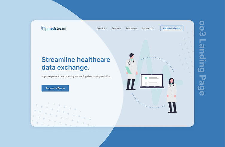
Daily UI #003 (Landing Page)
Having previous experience in pharmacy and nursing, I listened to many patients express frustrations toward the lack of communication between their healthcare practitioners (eg. pharmacist, family physician, specialists, etc), which decreased their quality of care and increased health risks. Since then, I have been considering solutions to address this gap in the system. So, for day 3 of #100daysofUI, I created a UI concept of a Health Information Exchange Platform inspired by all my previous patients!
Key Learnings:
💡 Craft the perfect headline (users will read the headline but only skim through the copy, so it’s important to write headlines that sell the point)
💡 Keep the action above the fold (make the main CTA highly visible for users to minimize effort and maximize conversion)
💡 Use images carefully (humans innately look where other people are looking, so placing headlines/CTAs in the same direction of where someone in an image is looking (*when possible) will likely increase conversion)
As always, I am open to any feedback for improvement! (:
