Rethinking Lemon App's Design System
Introduction to Lemon:
Lemon Cash is an Argentine fintech founded in 2019.
Widely popular in LATAM for offering an international prepaid Visa card.
Offers cashback in bitcoins on purchases.
Allows users to input Argentine pesos to buy, sell, and hodl cryptos.
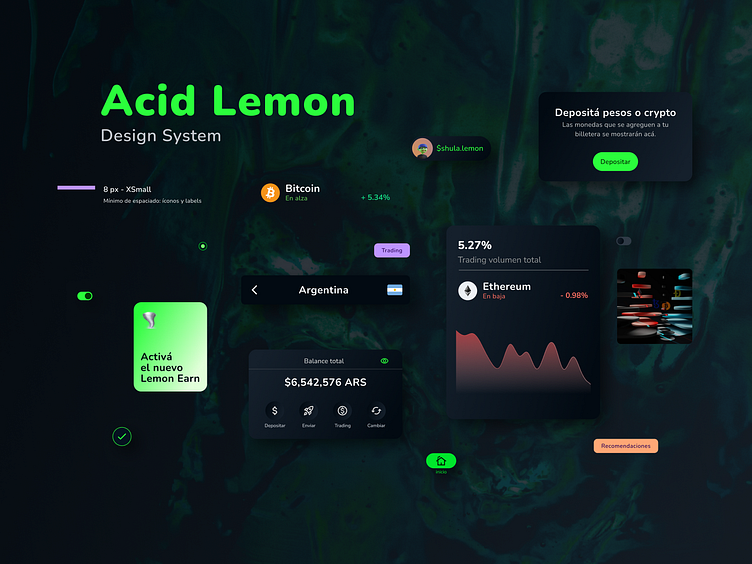
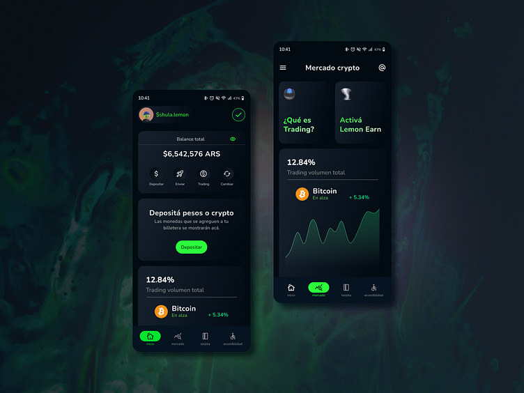
Features a user-friendly interface.
Educative Features:
Lemon's futuristic and innovative proposition allows users to invest.
For beginners, the "Earn" section offers tutorials to learn more.
Need for Design System:
Surprisingly, there's no official publication of its design system.
Negative reviews on the Google Store point out visual and functional flaws.
A redesigned system can offer enhanced user experience and value proposition.
Feedback from Users:
Users have described the app as "childish."
This feedback underscores the importance of refining the app's illustrations.
Aim to strike a balance – not too formal, but with a more intuitive color scheme for users.
Operational Changes:
Proposing a shift from the "Soft Próxima" (Adobe) typography to an open-source option like "Nunito" (Google Fonts).
This shift will refresh the app's overall communication.
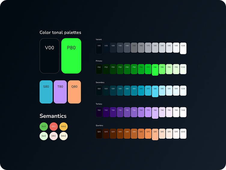
Color Adjustments:
Current colors offer opportunities for subtle yet functional changes.
These changes are pivotal for expanding the app's design system.
Layout Considerations:
Maintain scaling proportions.
Use a base grid of 8pt with 4 columns and 16pt margins to reorganize content.
Retain current button designs but adjust colors for better accessibility.
Icon Set Revisions:
Plan to modify the crypto icon set.
The goal is to update its visual appearance to harmonize with other design enhancements.
Heuristic Analysis:
Incorporate heuristic analyses to aid decision-making.
Ensure a user-centered design approach.
Iterate the product using a Sprint methodology to reach the most refined version during this case study's development.