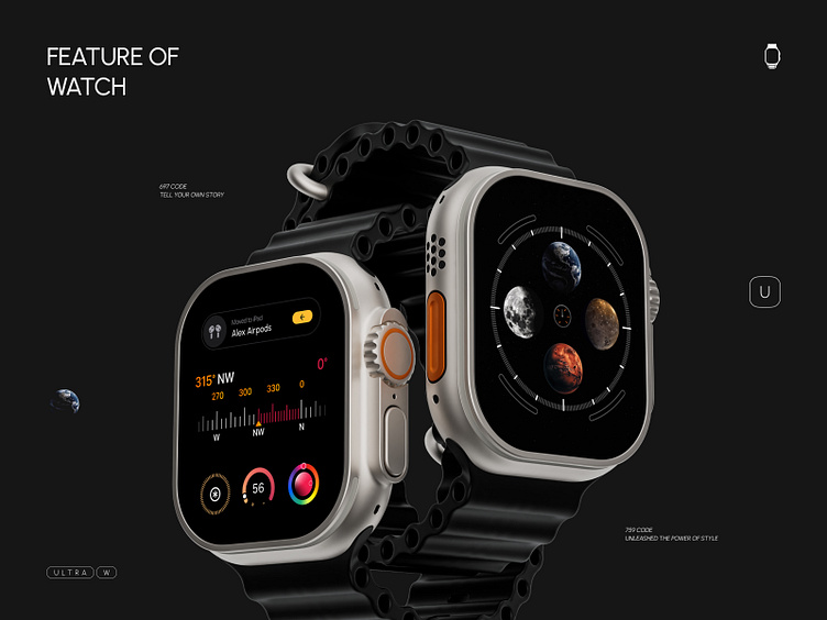
Design for Apple Watch Ultra
Hello Dribbblers! 👋
As wearable technology continues to evolve, the Apple Watch Ultra has taken the market by storm with its sleek design and advanced features. One of the key aspects of the watch's appeal is its user interface, which must be intuitive and user-friendly. In this article, we'll explore the top four areas of design focus for creating an optimal user experience with the Apple Watch Ultra.
CLOCK
The Apple Watch Ultra's clock design is a key component of its user interface. While the watch face serves a functional purpose, it also represents a unique opportunity for designers to showcase their creativity.
STOCK
The stock design of the Apple Watch Ultra is another important aspect of its interface. Users can access a range of information, from weather updates to stock prices, directly from their watch.
HEALTH
Tracking health and fitness goals With features like heart rate monitoring and activity tracking, the watch's health design is critical to its appeal.
hope you enjoy this design for Apple Watch!
Let me know your thoughts 🔥 And don't forget to press "L" if you like it 💕♥️
We are a Canadian design agency that helps startups and growing companies turn ideas into exceptional digital experiences. We can help you with every design need: UX/UI, 2D/3D illustration, branding, animation, you name it.
Need help with your design? Drop an email to design@duxica.com - mhdesignerfa@gmail.com.
telegram : t.me/mhdesignerfa


