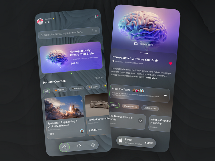
Learning marketplace with glassmorphism
Exploring glass morphism with learning marketplace.
I love the effects of frosted glass, it brings out so much especially when partnered up with textures. It's such a powerful design style that is very difficult to get right, especially when partnering up with colours.
Here is a online course market place that allows a user to enrol and purchase courses. in this instance its Neuroplasticity - rewire your brain.
When a user selects on a course rather than taking the user to a separate page, IOS's native slider overlays the page and displays the relevant information. Note how ive not added the back button as its more simpler to swipe down than to tap back on the top left.
Additionally ive tried to force payment as a replacement of the main navigation, some sneaky ecommerce tricks in play here.
Next time i would definitely like to explore more colour with glass morphism. Rather than being safe with the grey focus on using glass morphism to compliment images or type.
From a UX standpoint Im in love with using emojis to support tab's need to gain some user insight on how people perceive emojis as support readability in certain situations.
