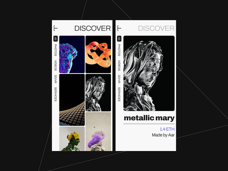
Discover NFTs
Hi! This is one of the works I made recently experimenting with tight layouts and dark colors.
Constraints
My inner talk shared a rule with me. "Don't be like them. You are constrained to only one Typeface."
Highlights
The highlights of this design include:
Tight layouts provide more space to design and are aesthetically pleasing for the purpose of a photo-based app.
The left menu bars provide a unique and fixed navigation: easy to reach, and differentiate's the user experience.
The product page is minimal and only includes essential details.
Next
Further tasks include interaction with the image page for purposes such as text details, buttons to go back and purchase, scroll interactions, etc.
What we see in the UIs, at least made by me, are usually only a part of the overall experience as I often omit the interactions portion.
Time
This piece may have taken from an hour to three hours to make as my goal was to quickly conceptualize this phase.
Thank you for your time.
Open to new projects (I work best with projects that suit a design theme with my recent work) at bvlash@gmail.com
