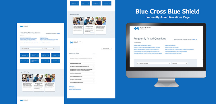
Blue Cross Blue Shield Frequently Asked Questions Page
Link to Portfolio:
Design Brief: Redesigning Blue Cross Blue Shield's Frequently Asked Questions (FAQ) Page
Background: Blue Cross Blue Shield (BCBS) is a leading health insurance provider in the United States. Their FAQ page receives a high volume of traffic and calls from customers seeking answers to their questions. This has caused a strain on their call center resources and a need to improve the user experience on the FAQ page.
Objective: The primary objective of this project is to reduce the number of calls to BCBS call center by improving the usability of the FAQ page. The secondary objective is to make the page more visually appealing and informative for the customers.
Target Audience: The target audience for this project is BCBS customers of all ages who are seeking answers to their questions related to their health insurance plans. The customers may range from individuals to small and large groups.
Approach: The approach for this project involved extensive research and collaboration with stakeholders and internal app UX designers on the BCBS team. The following steps were taken:
Research: The existing FAQ page was thoroughly researched, including a review of user feedback, call center data, and analytics. This helped in identifying the pain points and areas that needed improvement.
Ideation: Based on the research, several design ideas were generated to improve the user experience. The ideas were presented to the stakeholders and the BCBS app UX team for feedback and discussion.
Wireframing and Prototyping: The selected design ideas were turned into low-fidelity wireframes and then high-fidelity prototypes. The prototypes were tested with real users to validate the design.
Visual Design: Once the UX was finalized, a visual design was created that aligned with the BCBS brand guidelines.
Development: The final step is to work with the development team to implement the design changes and deploy the new FAQ page.
Outcome: The new FAQ page design reduces the number of accordions displayed on the page and simplifies the navigation by categorizing the questions. This makes it easier for customers to find the answers they need without having to call the call center. The new design also aligns with the BCBS brand guidelines and provides a visually appealing and informative user experience.
Next Steps: The final step is to work with the development team to implement the design changes and deploy the new FAQ page. This will involve discussing technical requirements and ensuring that the design is implemented as intended. Once the new FAQ page is live, it will be important to monitor the call center data and user feedback to ensure that the design is achieving the desired objectives.
Image by <a href="https://www.freepik.com/free-psd/user-interface-design-website-template_20548064.htm#query=ui%20template&position=1&from_view=search&track=ais">Freepik</a>
