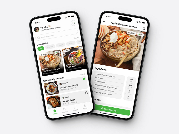
RecipePal → Case Study
About the project
Essentially, I started this project to practice my UX/UI design skills. I wanted to create a short case study to show how I approached this small project. My idea came from seeing many poorly thought-out designs on Dribbble. So, I decided to make a simple 2-screen design project where I focused on what would be useful for the user.
Role: UI/UX Design & Branding
Responsibilities: User Research • Wireframing • Usability Test • Visual Design
Timeline: Jan - Feb 2023
Project Type: Mobile App Design
Tools: Figma
The process
By looking into similar apps and how people use them, I created several wireframes. My goal was to design an app that makes it simple for users to get around and find recipes effortlessly. As I dug into how information is organized, I realized that certain details are quite popular among users. Things like cooking times, servings, category tags, and ratings play a big role. They act as helpful markers, guiding users to find exactly what they're looking for in the app.
Final Design
The home screen
The home screen allows users to search for specific recipes and browse through various categories. It displays essential recipe information, allowing users to make quicker decisions when choosing what to cook. Users can also view what others are currently creating and save and share their favorite recipes with friends.
Recipe Details Screen
The recipe details screen provides users with the most important information for the next recipe they plan to make. This includes the picture, details, recipe steps, and other important nutritional information.


