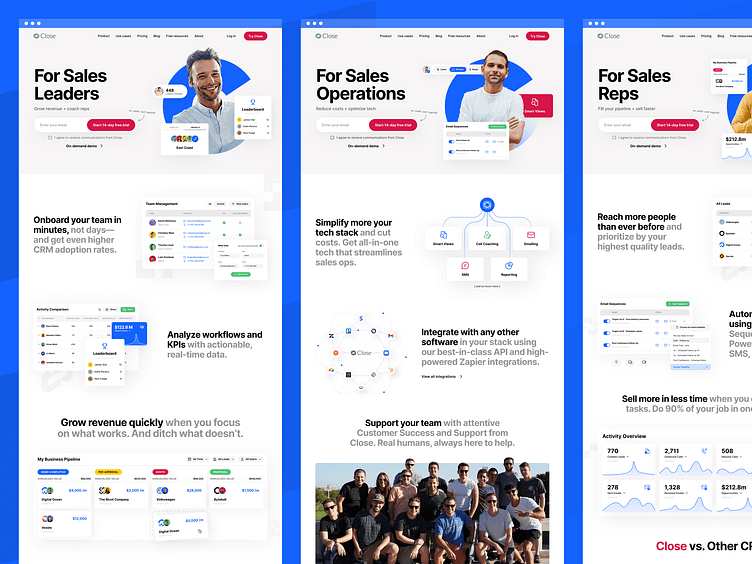
Close.com - SaaS Website Design
Excited to share that we worked on the new website for Close!
You can see the live site here: close.com
Close approached us because they felt their website was outdated. It was too safe and conventional and didn't represent their brand well.
We worked with the Close team to explore a new look and feel for their brand and create a website that would resonate with their best customer.
The result is a bold new website that matches the Close brand, puts the spotlight on their product and will help them scale faster.
Here's what Danny Greer, the Director of Marketing at Close had to say about our collaboration:
“The main problem with the old website was that it was ‘too safe’. We wanted the new website to feel bold and differentiated. We also wanted to create strong visitor paths to our main conversion points (signup, trial, etc).
Beetle Beetle helped us do just that. Working with them felt like I had an entire marketing, design and development team in-house.
We’ve gotten feedback from both customers and prospects alike that they absolutely love the new site.
Whoever said “Good, fast, and affordable...you can only have two” never worked with Beetle Beetle."
Project Scope:
Brand exploration and art direction
Website and landing page design
Custom product visuals design
Webflow website development
Look out for more shots from this project.
Need a unique, high-performing website that helps you stand out in a sea of competitors?
Get in touch: sumit@beetlebeetle.com | Visit our website
