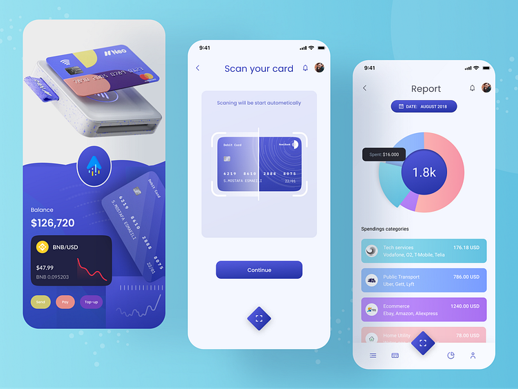
Finance Mobile App Design - Fin-Tech
Let's share a minimal Design. Here i am doing the With Black and White first time,
From the first screen, first let's start search something then see your cards, also you can add card. You can see your investment by Day, Month, Weeks, Year
Though i make a mistake in design. I keep it Month selected instead of Day
Then you can see this day transaction
2nd screen is normally Splash screen, Please pop up to go next screen
Let's Start the 3rd screen, This is report screen and first you will see a pie.and then you see the spending categories
----------------------------------------------------
Any Project Inquiry?
📩 Contact us if you need any custom UI/UX design Services.
🤝 Say Hello: sylgraph.agency@gmail.com / facebook / Instagram / Linkedin
More by syful islam Srabon View profile
Like


