LikeFridays - Case Study
Reimagining Online Bookings in the Travel Industry
LikeFridays is a startup based in the Netherlands, owned by an experienced entrepreneur who has extensive experience travel & hotel industry.
This seems like a traditional booking app, but believe me, this is not the app you think.
Spoiler Alert:
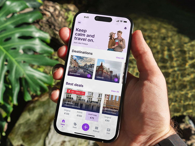
What happened when combining Airbnb and eBay? 🫢
Project Overview
Project
LikeFridays iOS Mobile App Concept Redesign
Challenge
Redesign the original concept with giving a modern look and feel while enhancing the overall user experience.
Platform
iOS
Deliverables
User Experience Enhancement
User Interface Design
Style Guide
Timeline
3 Months
My role
Lead Product Designer / UI/UX Designer / Project Manager 🤠
Tools
Figma, FigJam, Zoom, WhatsApp, Google Docs, Zeplin, Adobe Photoshop, Adobe Illustrator, Adobe Acrobat
Travel & Lesure is one of the most competitive industries with much big fish. The first question is why users choose this app over the others. The answer to that seems tricky but LikeFridays got an upside-down approach for the next-generation hotel booking.
In this case study some details related to the app concept are intentionally excluded until the app is officially launched to the public.
So in a nutshell, I'll share how we redesign an app to meet the expectation of both potential users and client businesses.
Let's jump in.

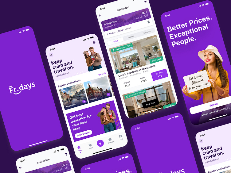
LikeFridays mainly focuses on building personalized experiences for travellers and hosts to become more profitable by acquiring more guests and creating a real-time auction mechanism.
The project kicks off with some knowledge-sharing sessions with the client and my team to build a solid understanding of the problem we're going to solve and mainly understand the LikeFridays business model and how its concept is designed to solve the user's problem.
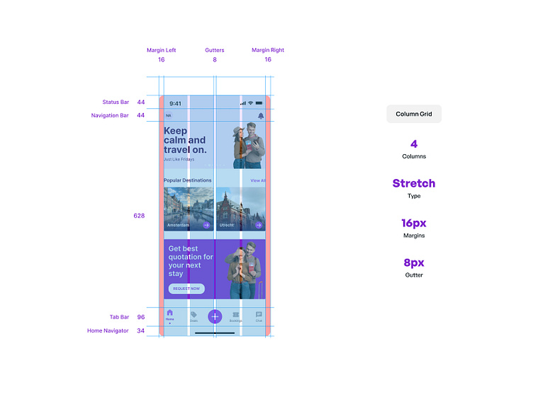
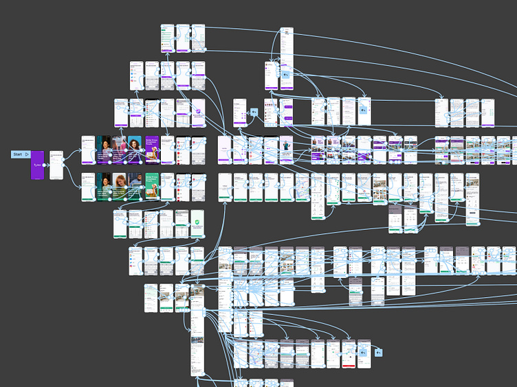
The design was followed by the Apple human interface guideline and the experience we gathered over time from mobile app design works. Setting up guidelines and a framework is the key to layout consistency.
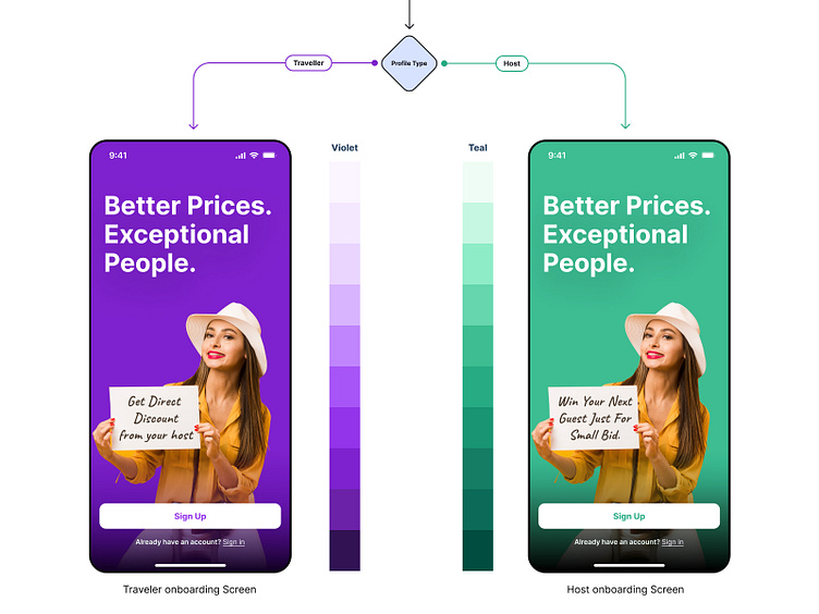
Based on the potential user profile we have introduced the colour profile which clearly sperate the user's experience by focusing on colour meaning.
For Violet is used for the traveller to give more luxury, and royalty feeling while Teal colour to the host to give encouragement and possession.
A style guide was created after curating the best typography for the design based on personality, usage and font licensing.

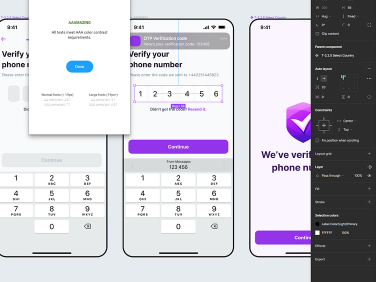
To achieve better readability, colour contrast checking is carried through the designs to make sure core features are maintaining the AAA readability standard.
Hi-fidelity prototype with both traveller and host used for the final stage of testing with the selected potential users in the Netherlands.
Finally, we designed a real-time collaborative mobile app for the most completive industry introducing a new look and feel along with brand new experiences for both travellers and hosts.
Can't wait to see until the actual product launch to the market to see how users experience the app we designed.
✨Thank you✨
Press "L" or love if you like it, and feel free to give some feedback 🥰
Have you got a fantastic idea?
Let's start the chat! : 1990nalindu@gmail.com