Aurum Design System
As part of the broader project at Contemi, taking legacy desktop software into cloud-based SaaS (Software as a Service), we needed a unified, modern (yet timeless), look. The final product needed to be co- branded/white-labelled with Contemi’s customers. The solution was to create a visual identity for the WIN platform and to create guidelines and design system for developers and designers to use not only on this project but across the entire Contemi group of companies. I produced designs and documentation, working with the lead developer to expand this into a front- end framework and interactive design system manager.
Context
Contemi Wealth produces software for the wealth management and financial services sector.
The Process
Starting with typography, I selected typefaces, fonts and sizing, chose to use an eight-pixel grid structure, selected icons and created rules for other components and elements.
Each module needed an individual icon that created a unified look. Using a two by two grid, three shapes (a square, quarter circle and leaf), and four levels of opacity, I created a repeating and changing series of icons that could form an interlocking pattern. I named this after the linguistic term Reduplication.
Breaking the colours into palettes for specific tasks; the neutral palette is a set of grey tones, that form the base for the design, creating depth and a foundation for the other colours. The semantic palette conveys intent; danger, success, warning, information, buying and selling. Each intention has four tints, for flexibility in application. The data palette is for charts. Finally, there is the branding palette, which is set by the customer.
Because of the white labelling of the product, the design had to be easily co-branded. We chose to use one primary and a secondary brand colour and apply these throughout the design. The reduplication pattern and icons sit over the primary brand colour to make them integrated into the customers branding.
During the production of the design system, there was a change of ownership of the company. We took this opportunity to refine the inherited WIN logo. I redrew and reinterpreted the concept of the interlinked WIN, bringing it in line with the look and feel of the rest of Aurum. I also extended the branding to include a wordmark and two lockups for vertical and horizontal usage.
Solution
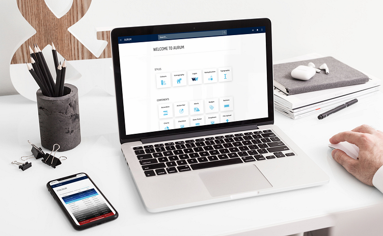
The development team produced a shared code library. Starting with the essential styles and elements, this grew as we started production on the various modules. To help support both the growing UX team and the developers, we needed a documented design system manager and opted to produce our own. Aurum DSM was an opportunity to refine and define everything we had created while building the WIN platform. Split into sections for Styles, Components, Patterns, Layout primitives, Documents and Tools; this is a resource for developers, designers, business analysts, product owners and the whole Contemi team to use when creating products.
Reflection
For me, the Aurum design system represents more than just a new look, but it embodies the changes that have happened during my time with Contemi. More than just changing how they deliver their software, but a shift in attitude adopting a user-centred approach. The new design system created excitement throughout the team at Contemi. It was amazing to see this build across the business teams and developers. This excitement continued across the sales team; their enjoyment in demonstrating the new products using Aurum was visible. The existing and potential customers shown these products returned unanimously positive feedback and resulting in more sales.
I am incredibly proud of Aurum, but more so of the team that contributed to, the development and more importantly, implementation and delivery.


