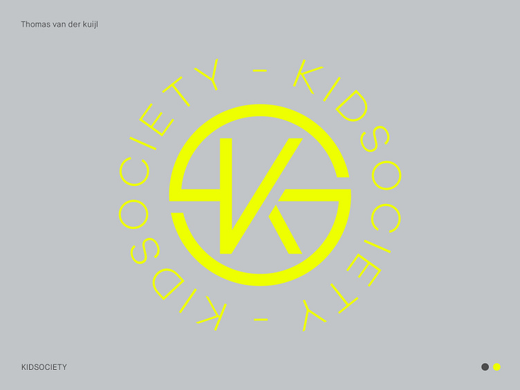
Neon yellow & gray identity for webshop store
A Playful and Stylish Emblem for the Modern Child, KIDSOCIETY
Hi there friends! As the designer behind KIDSOCIETY's logo, my mission was to create a visual identity that encapsulates the brand's cheerful, modern, and high-quality essence. The result is a versatile emblem that perfectly represents KIDSOCIETY's dedication to providing the most fashionable baby and children's clothing and toys.
I opted for a contemporary design with a streamlined aesthetic, ensuring the emblem is easily adaptable across various platforms while maintaining KIDSOCIETY's playful and recognizable presence. This design choice allows the brand to effortlessly exude its fun and trendy personality, appealing to both children and their parents alike.
Color played a crucial role in capturing the brand's spirit. By incorporating the client's preferred neon yellow and soft gray hues, the logo strikes a balance between eye-catching vibrancy and timeless elegance. The neon yellow signifies the excitement and joy KIDSOCIETY brings to children's lives, while the soft gray conveys a sense of reliability and sophistication, reflecting the high-quality products that parents can trust.
With a playful tone-of-voice in mind, the fusion of modern colors and the emblem design establishes a dynamic and unforgettable visual identity for KIDSOCIETY. As the designer, I am proud to have crafted a symbol that not only embodies the brand's essence but also sets the stage for their continued success in the baby and children's clothing and toys industry.
___________________________________________________________________________________
Let's team up and elevate your brand with Dutch Design!
Don't hesitate to get in touch with me via E-mail:
🚀 info@thomasvanderkuijl.com
💼 Let's link up on LinkedIn and take our professional networks to the next level!
📷 Join the Insta-party and catch my latest projects today!
