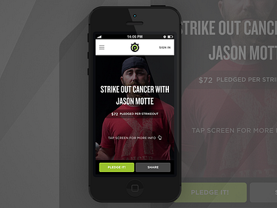
New Campaign Page
I spent an awful lot of time brainstorming an ideal layout for public campaigns, arguably the most important view of the Pledge It application. We wanted it to feel intuitive and comfortable when using a phone, and ultimately exciting no matter what device you used.
When arriving to a campaign page, you're presented with a huge image, with the headline as prominent as space allows, making every campaign look like a showcase and something you want to learn more about. We highlight the main actions we want users to take (Pledge/Share) and give users a simple way to find out more information about the campaign.
Check out some of our favorite Pledge It campaigns:
* Help the Bengals Sack Pediatric Cancer
* Seager vs. Cancer
* Strike Out Cancer with Jason Motte
* Support the University of Delaware Club Softball at Regionals
* Jesse James: Reps for Research
And of course, a shameless plug of my own campaign.
Want to create your own campaign? You can do that too!


