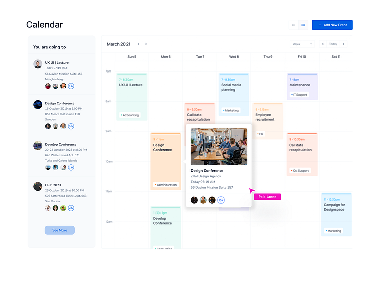
Calendar info | UX Gantt chart
Calendar info | UX Gantt chart
Navigation: The calendar page should have easy-to-use navigation that allows users to easily move between months and years.
Current Month: The current month should be prominently displayed, along with the current date.
Events: The calendar should include events for each day, displayed in a clear and organized manner. Users should be able to easily click on events to view more details, such as time, location, and description.
Filters: If the calendar includes a large number of events, filters can be helpful to allow users to narrow down their search by category or type of event.
Search: A search bar can also be useful to allow users to find specific events or dates.
Add Event: Users should be able to easily add their own events to the calendar, with the ability to specify date, time, location, and other details.
Responsive Design: It's important that the calendar page is designed to be responsive, meaning it should look good and function well on all devices, including desktops, laptops, tablets, and mobile phones.
Color-coded Categories: Color-coded categories for different types of events can help users quickly identify and sort through events they are interested in.
RSVP: If the calendar includes events that require RSVPs, a simple and intuitive RSVP system should be included.
Sharing: Users should be able to easily share events they are interested in on social media or via email.
Don't forget to press "L" if you enjoy watching this ❤️.
You can read my article on creating a "UX philosophy or who are UX Researcher"
Get in touch with me:
Behance | LinkedIn | Instagram
📩 Reach me at: linc.effect@gmail.com
