🌱 Plantiê • online plant shop redesign
Context
Plantiê is a super cool Brazilian online marketplace that offers a wide variety of plants and gardening supplies, such as pots, fertilizers, and tools. Their high-quality products makes it a great destination for plant enthusiasts and novice gardeners alike looking to bring a touch of nature into their homes.
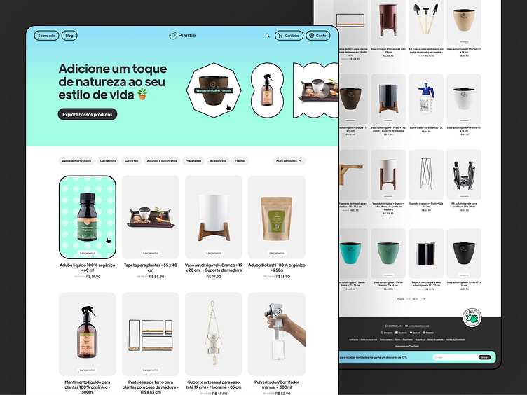
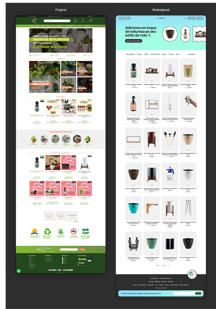
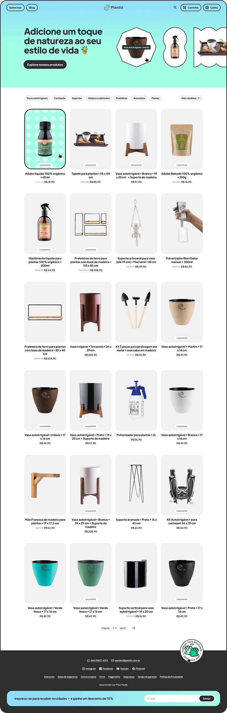
I have recently bought a self-watering pot from Plantiê and loved both the product and the company. While I was navigating through their website, though, I went through a few UX problems, such as having difficulty to figure out how to browse categories, and also noticed some UI stuff that could be improved, such as lack of clear grouping and visual hierarchy.
So I decided to work on a revamp for their homepage. Overall, my goal was to create a more user-friendly, straightforward and visually appealing page that would provide a more enjoyable shopping experience for customers.
Objectives
In the process, I aimed to:
Simplify the navigation
I made an effort to make the site navigation more user-friendly by concentrating all the filtering controls in the same place, by putting them in a prominent location and by using clear, concise labels. I also used the “pill” component for the filters, which is a more familiar design convention/pattern for users.
Establish a clear information hierarchy
I tried to group and display contents in a clearer visual hierarchy, in order to guide user's attention and help them quickly and easily find the information they need.
Maximize white space
I used white space to create breathing room around key elements and make it easier for users to focus on individual pieces of content. This not only improves the readability and scannability of contents, but also, in my point of view, enhances the overall visual appeal of the site.
Reduce the number of colors in the palette
By limiting the number of colors, I tried to make it easier to draw attention to the important information on the site. By focusing on key tones of light green, light blue, white, and black, I tried to convey a more natural and calming vibe with the palette, more cohesive with the gardening products.
Use consistent design
By using consistent font sizes, colors, and spacing, I tried not only to create a cohesive look and feel but also to reinforce the brand identity and help make the site feel more polished.

Thanks for stopping by! Please press "L" if you liked it ❤️