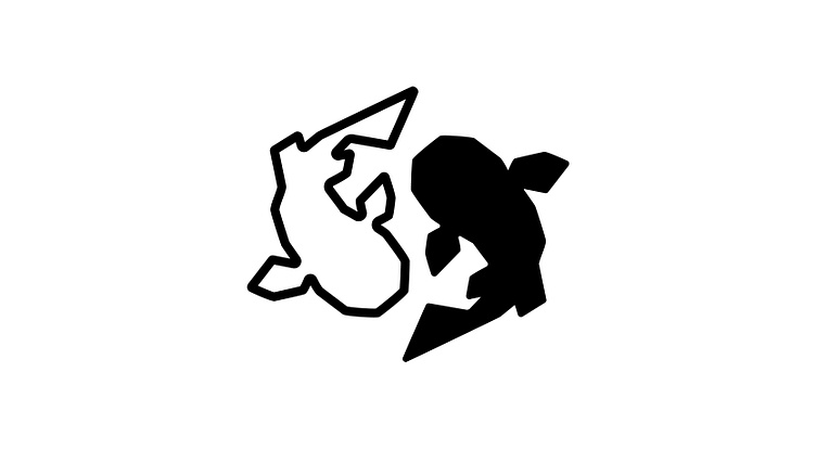
Redline CR Logo
This was a recent client project that I enjoyed watching develop from a highly detailed element into something more minimal. Two key elements we wanted to ensure was that it worked with the company’s existing Wordmark and was distinguishable on both large and small products the company was planning to launch - from T-shirts to keychains. The final result is what makes a solid logo great in my eyes - simple yet distinctive!
Click the ❤️ Like button if you want to see more projects like this. Make sure to leave a comment below if you have feedback - I'm always looking to grow!
Need a designer?
I’m a freelancer available for hire! Contact me via my Dribbble inbox
or direct e-mail: NicoleSuchin@gmail.com if you want to work with someone who’s flowing with creative ideas, professional yet positive, and eager to help bring your vision to life.
Check out more of what I do


