WIP. Website design for a insoles landing page.


We continued to apply our principle of clean and modern design for our clients.
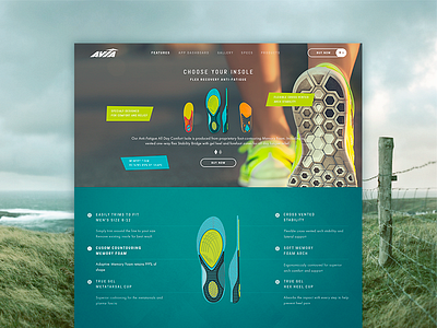
In this promo page we tried to came up with something that represent Avia Insole as it is: functional, simple and still vivid and stylish.
The final solution seems obvious, but all the really thought out products look obvious. The simple grid inspired by simpleness of the product itself. Nifty and active color palette inspired by the way Avia’s customers live. That’s how we do that :)
Press "L" to show some love!
Don’t forget to follow Zajno on social media and feel free to drop us a line:
Website | TheGrid | Twitter | Instagram | Medium