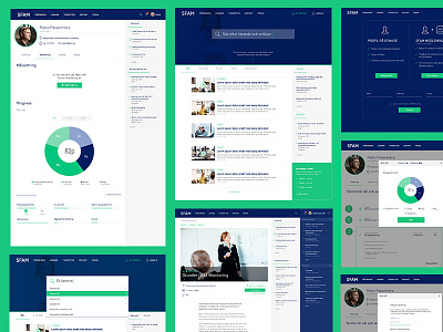
Different Screens Flat Design
Check out attached images for Retina!
Here is some screens of an advanced site for a Doctors Network i have made. All responsive optimized.
The start page is really search focused so gave the input field the first row. A design with much space makes it easy to see whats going on in this everyday tool.
The doctors can set up goals, and have an easy overview how long they have left to success.
Hope you enjoy!
PS:
Check out the gif-animation of the login:
https://dribbble.com/shots/2135124-Login-animation-feedback-Error-and-Success?list=users&offset=1
More by inUse View profile
Like


